The Design
Three platforms, one cohesive system
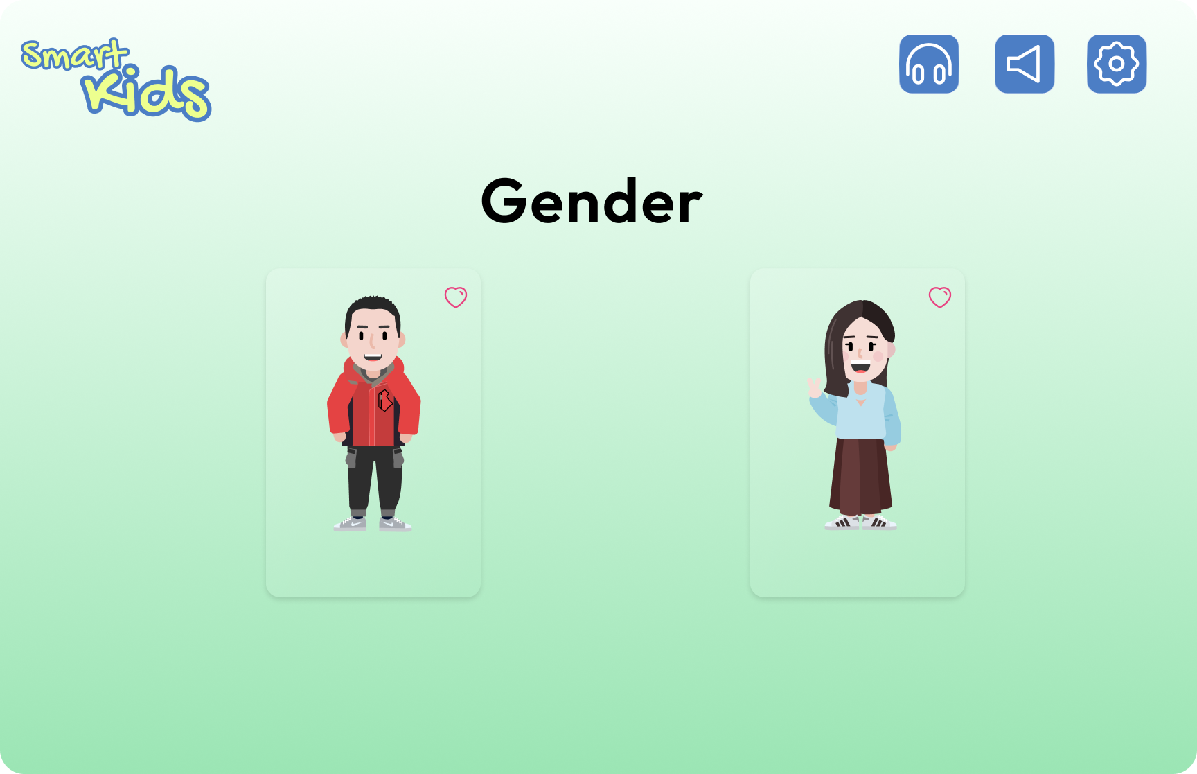
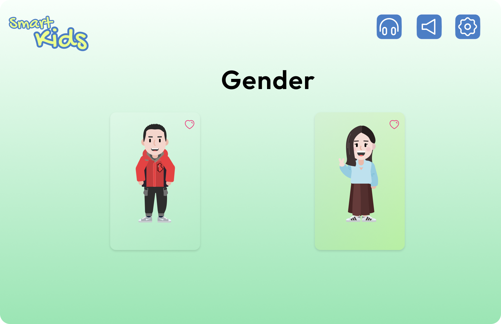
🌐 Web : Onboarding & Authentication
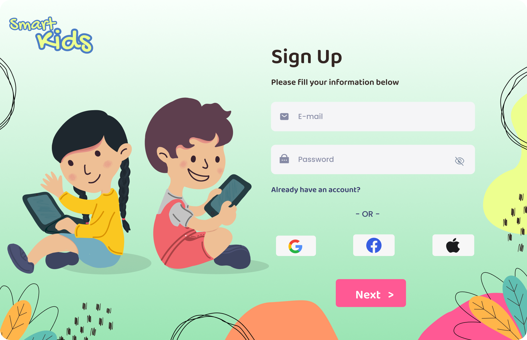
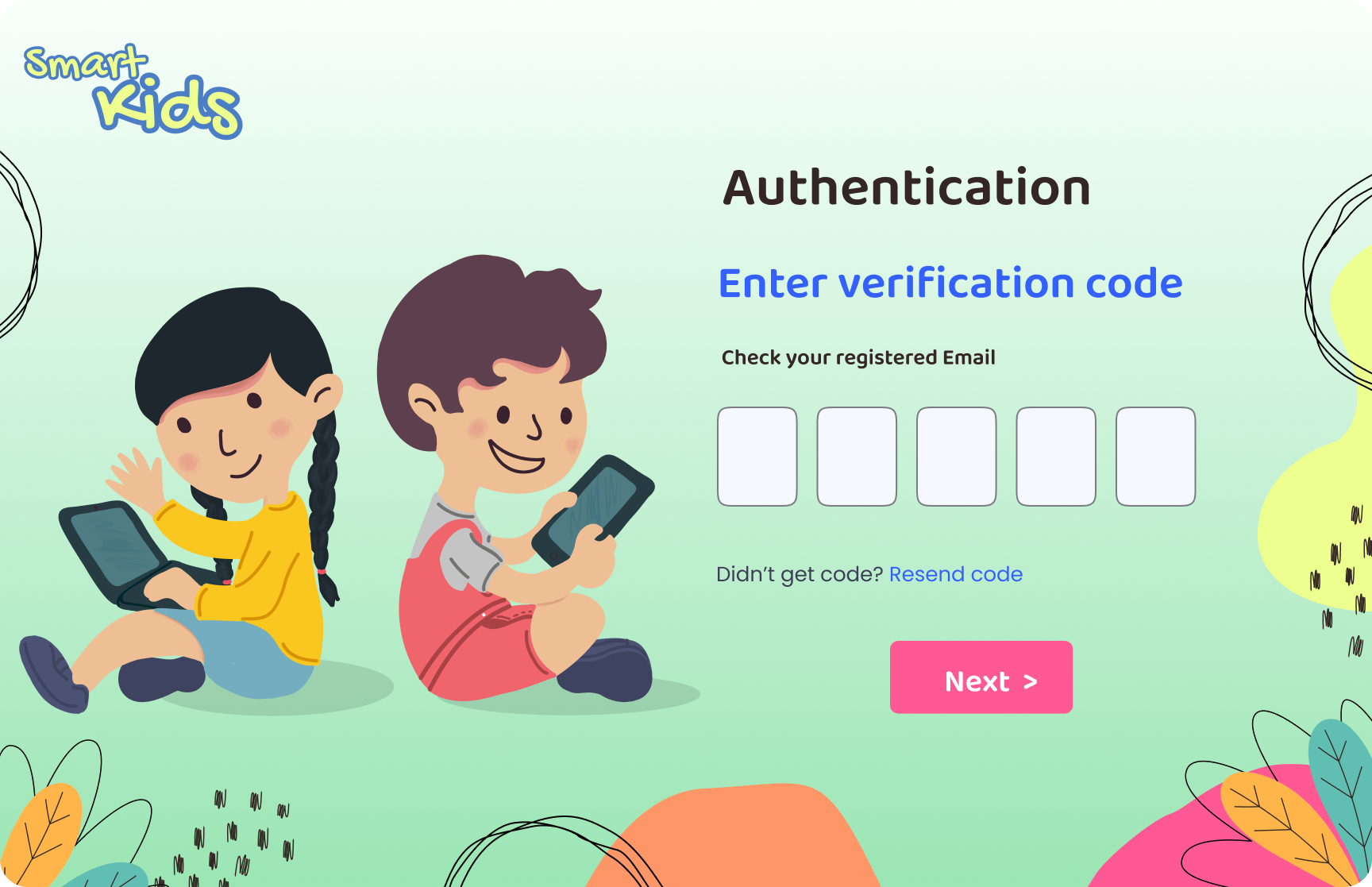
The web platform handles the full sign-up and avatar creation flow,
establishing the child's identity before they enter the learning
environment. Sign-up includes Google, Facebook, and Apple SSO to reduce
friction for parents.
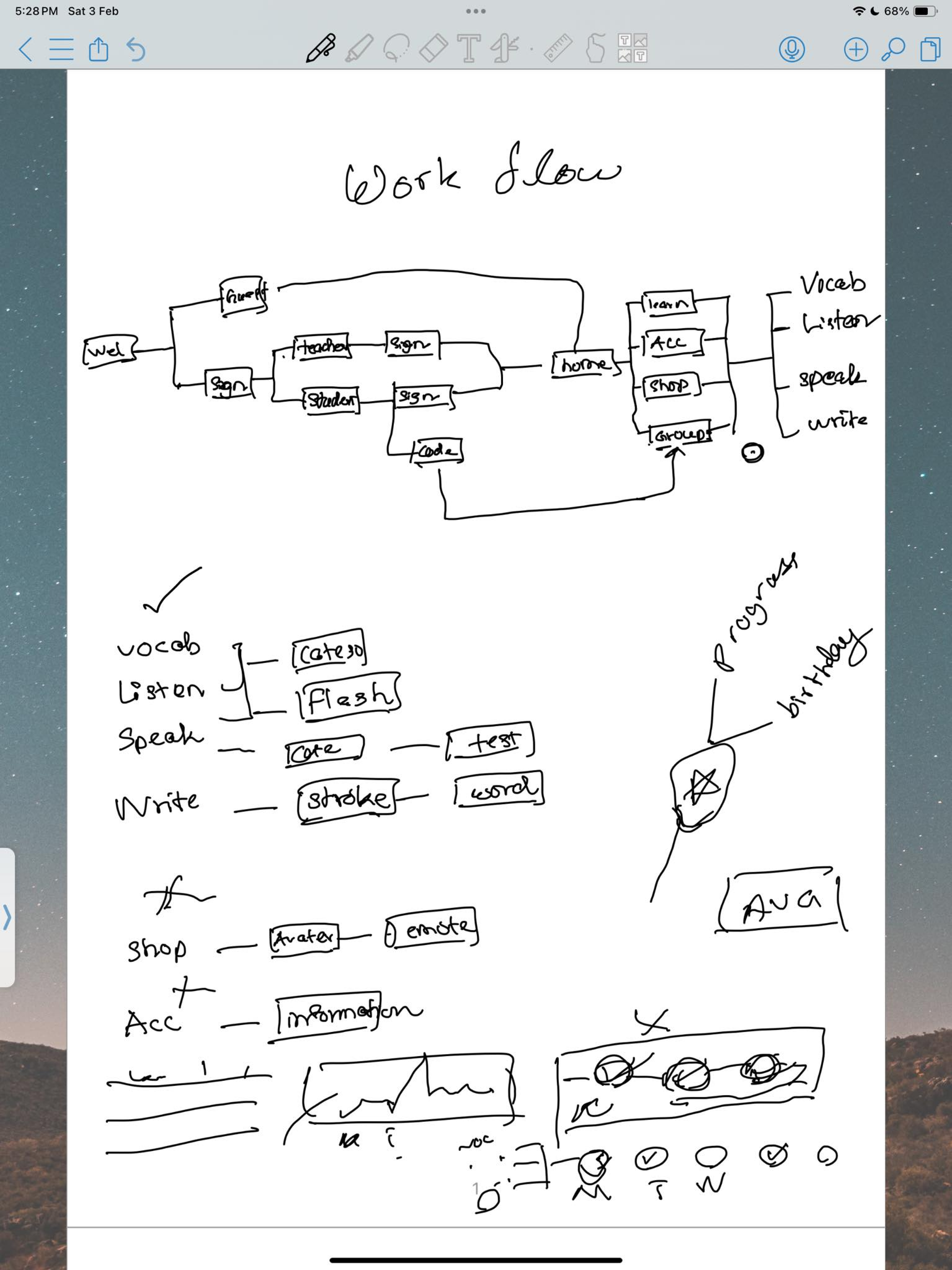
Onboarding flow: Launch → Sign Up (with SSO) → Email verification →
Avatar gender selection. The green background highlight on selection is
a direct application of Visibility of System Status.
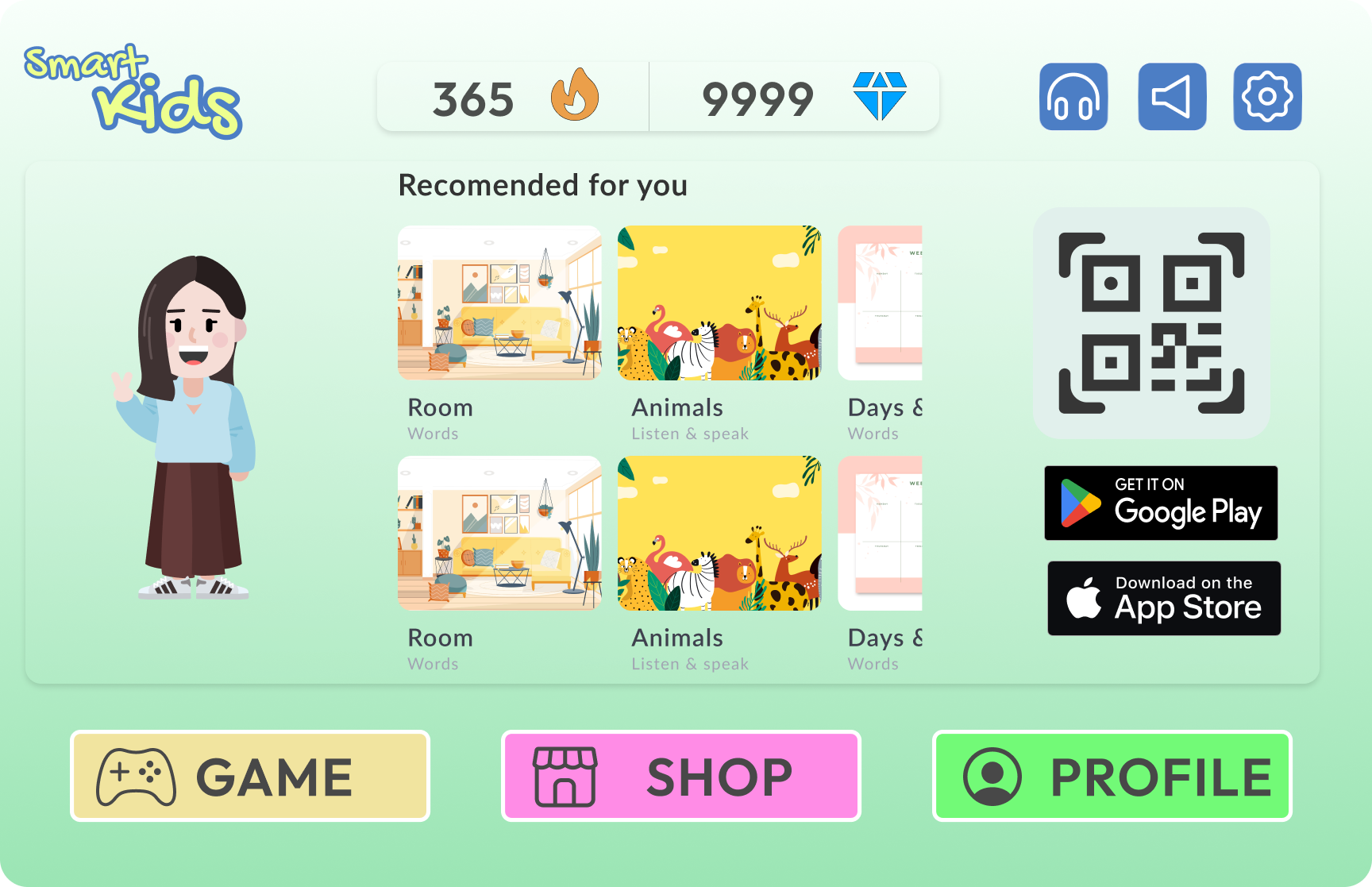
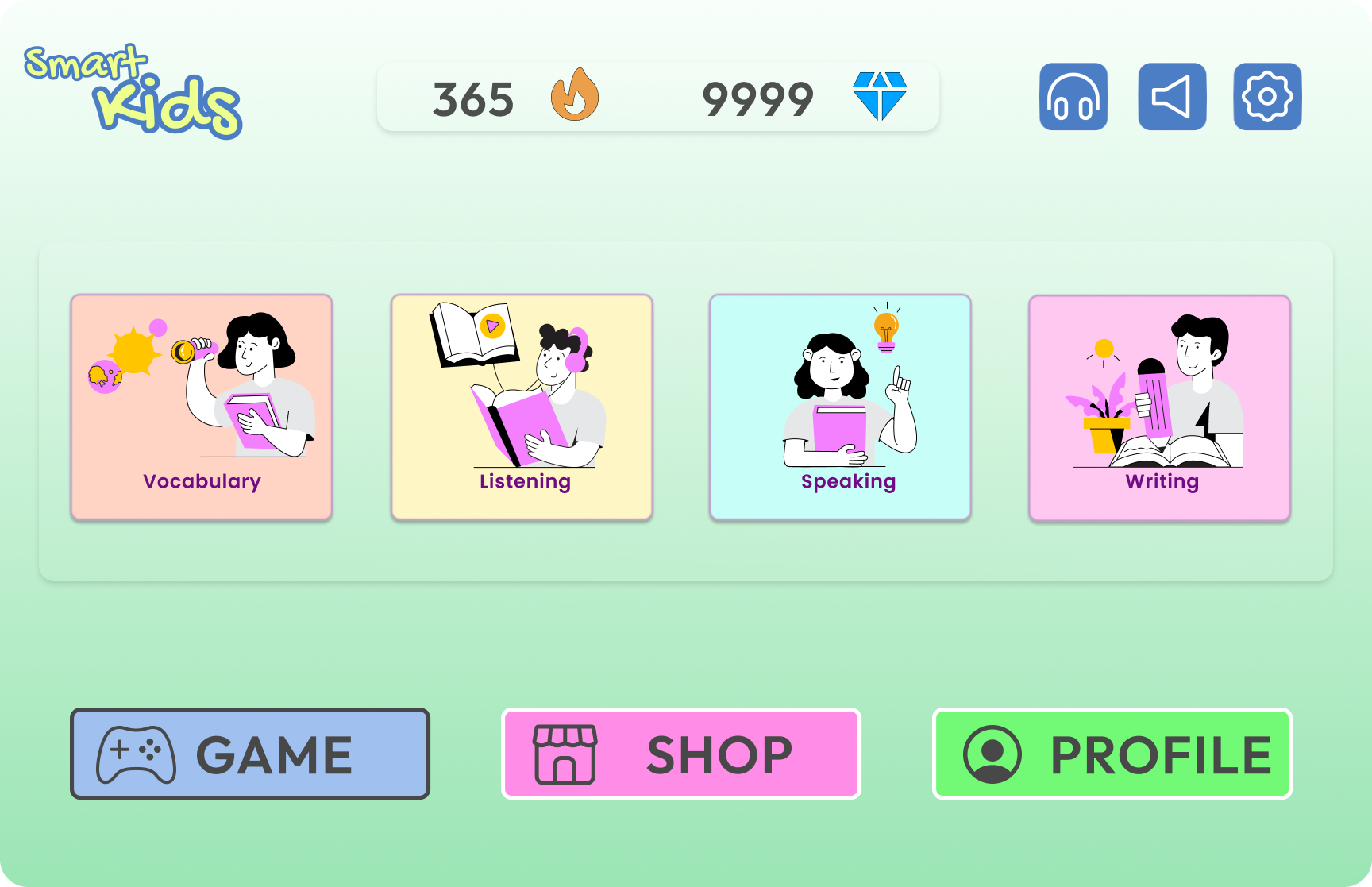
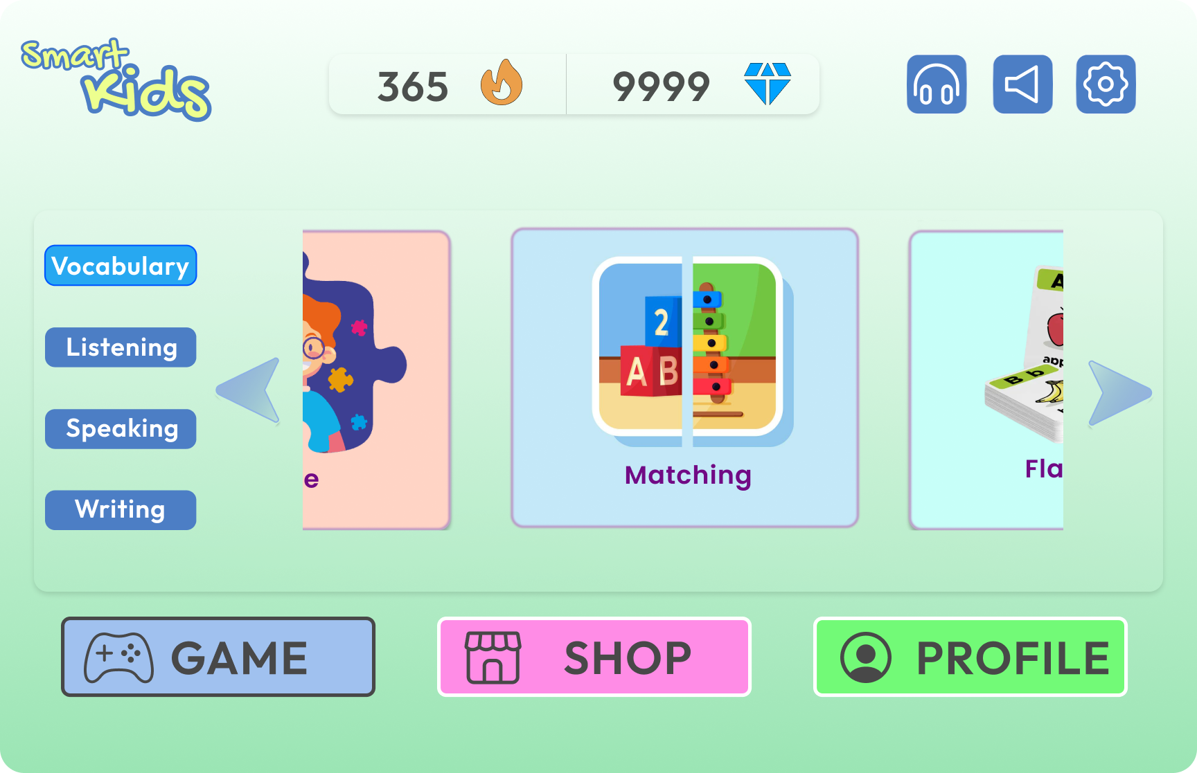
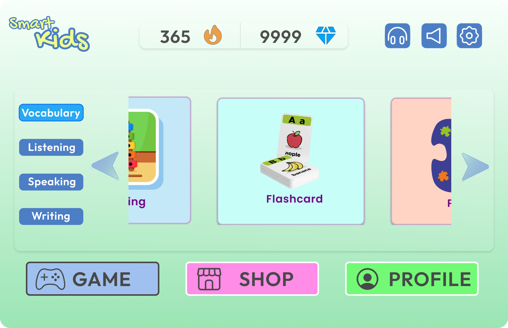
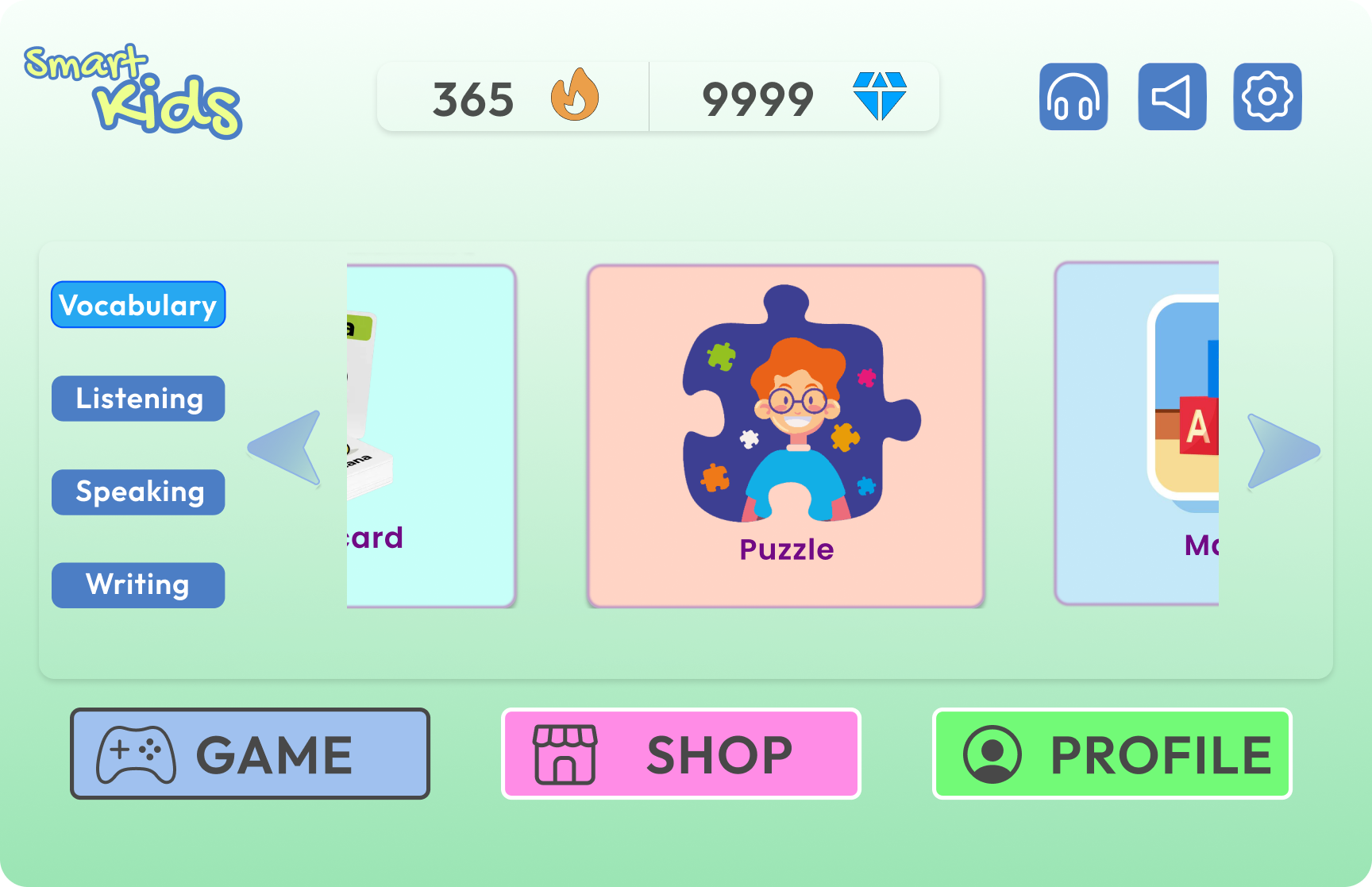
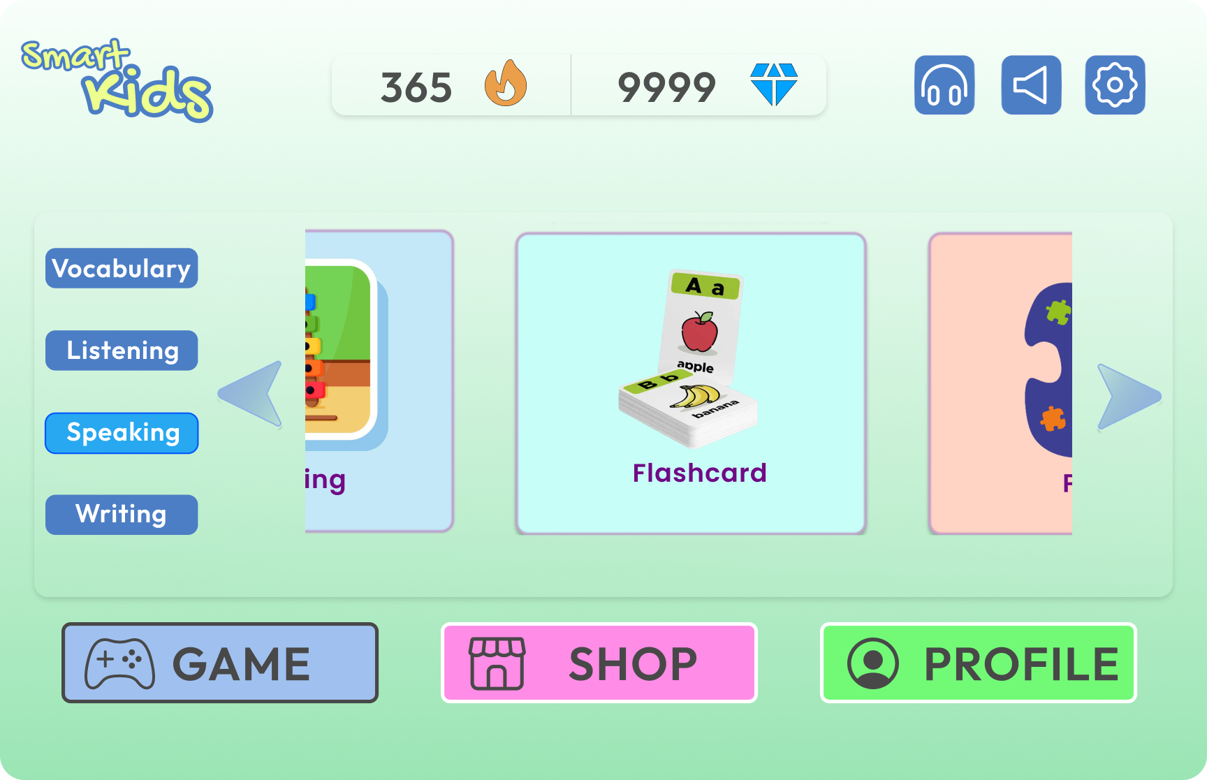
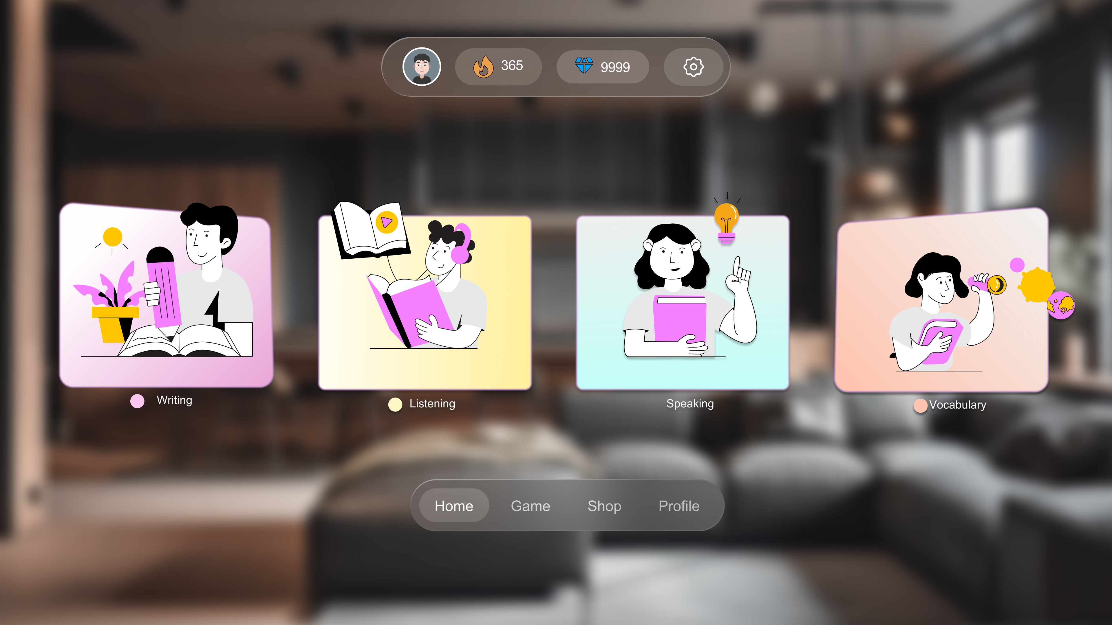
🌐 Web : Home & Learning
The home screen shows the avatar alongside recommended content,
persistent streak/diamond counters, and a QR code for cross-device
continuity. The game selector uses a left-sidebar navigation combined
with a horizontal card carousel — keeping all categories visible
(Recognition over Recall) while allowing browsing within each.
Home screen with QR cross-device link, 4 skill categories (Vocabulary,
Listening, Speaking, Writing), and scrollable game carousel within each
category
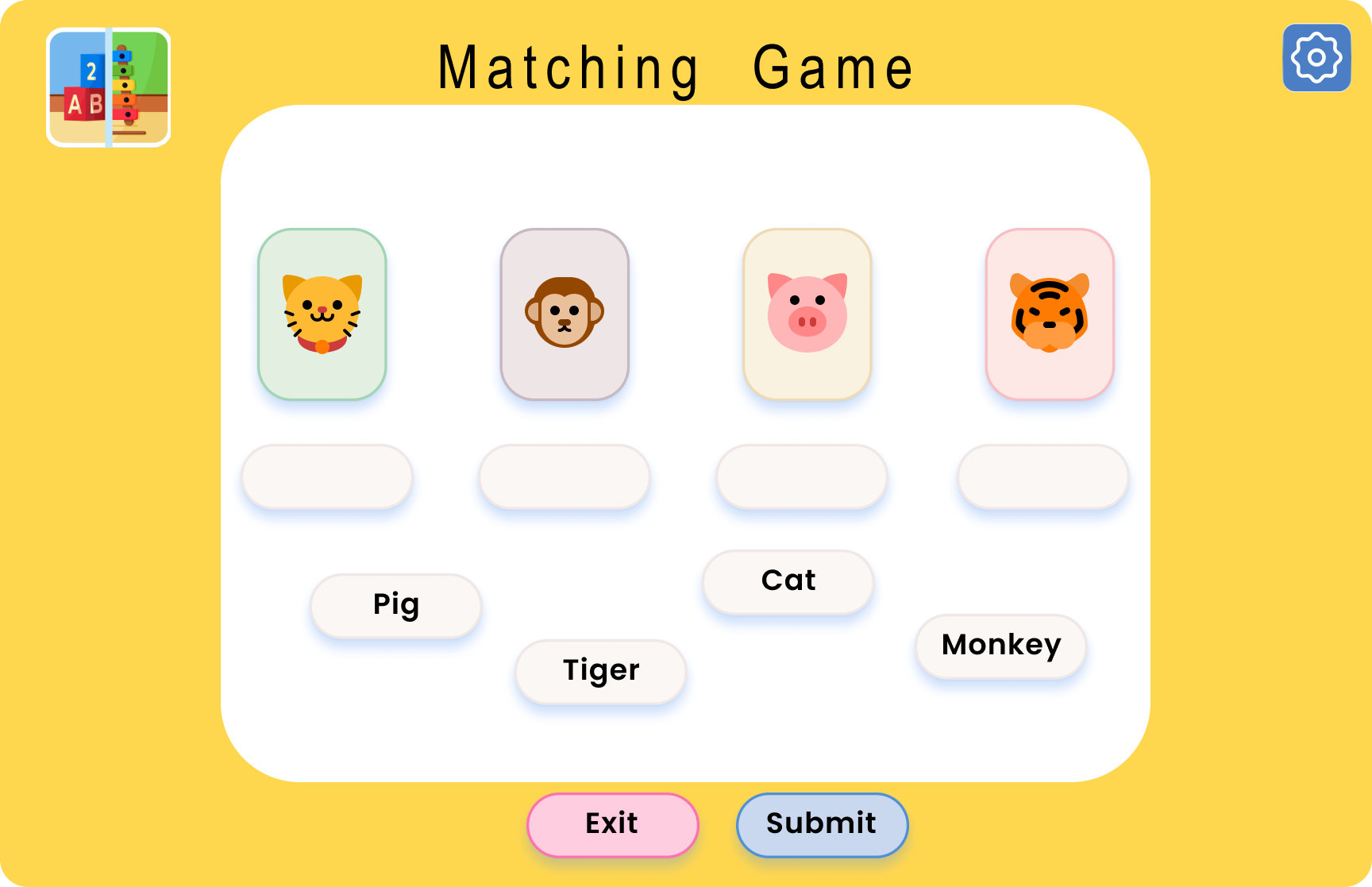
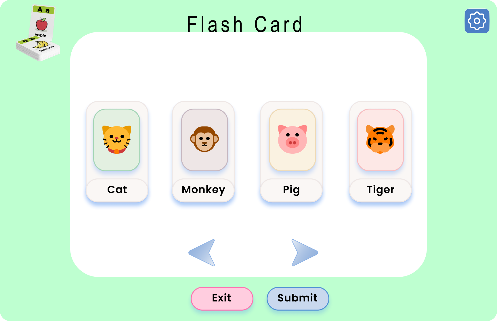
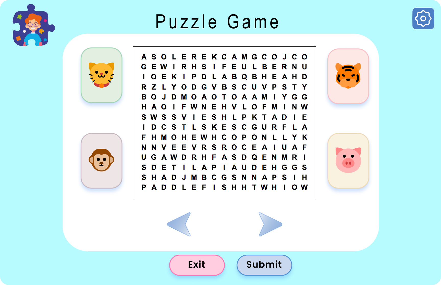
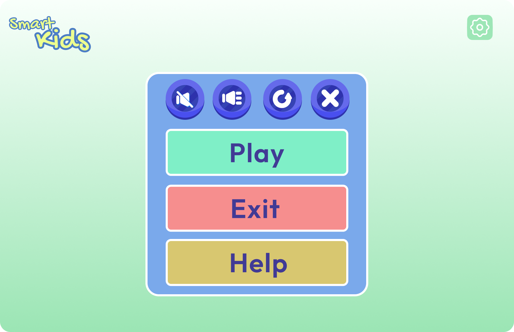
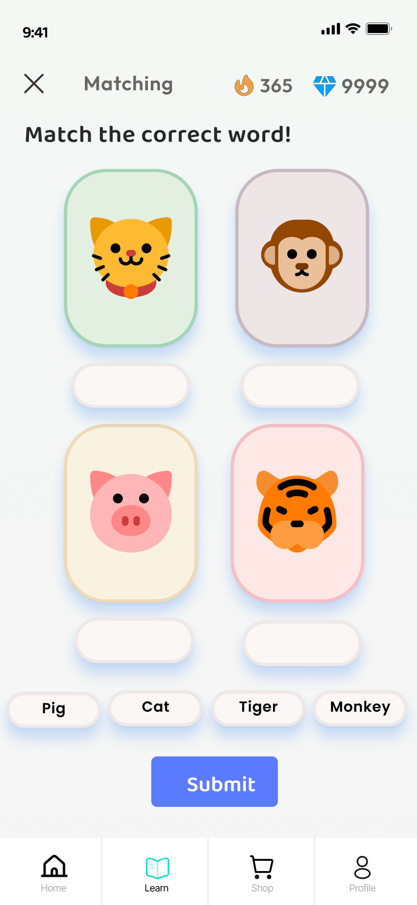
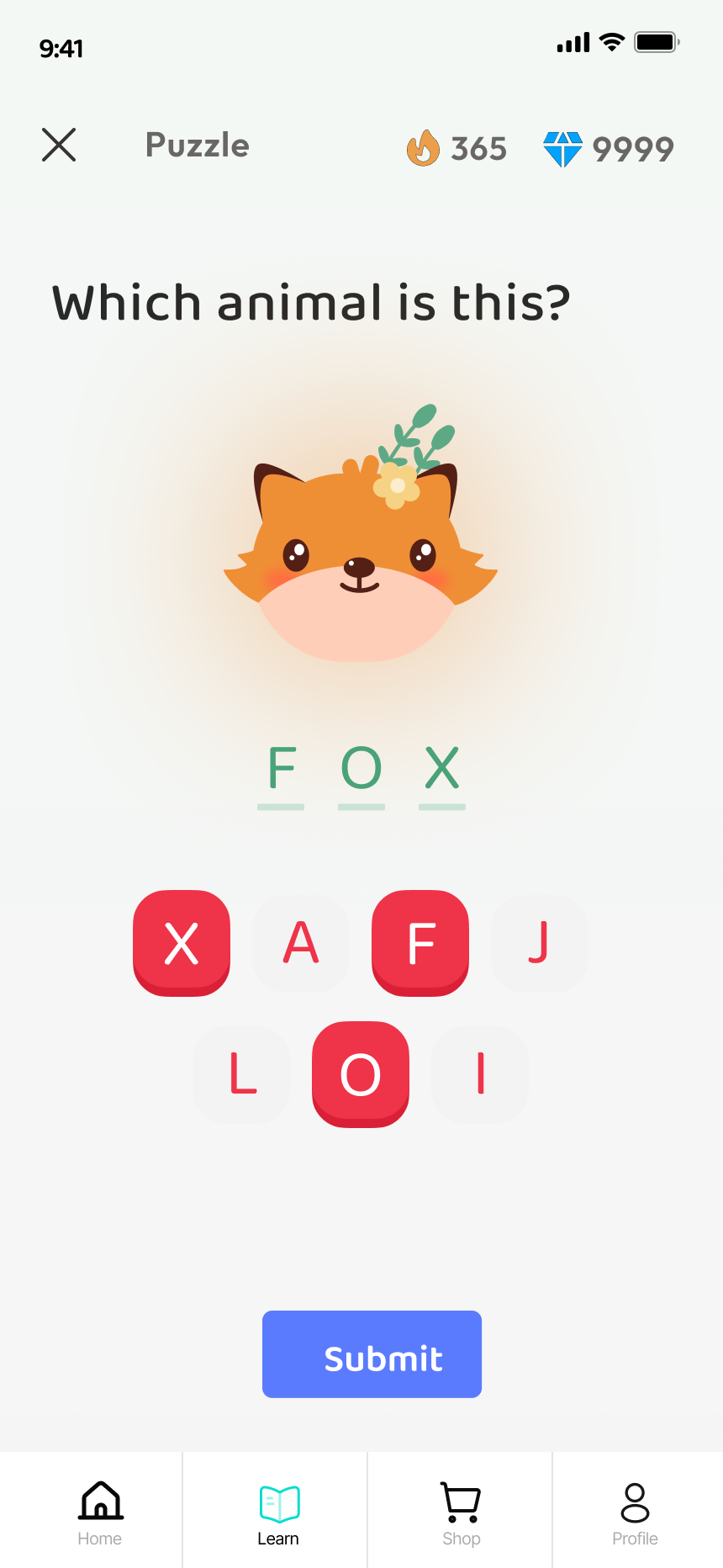
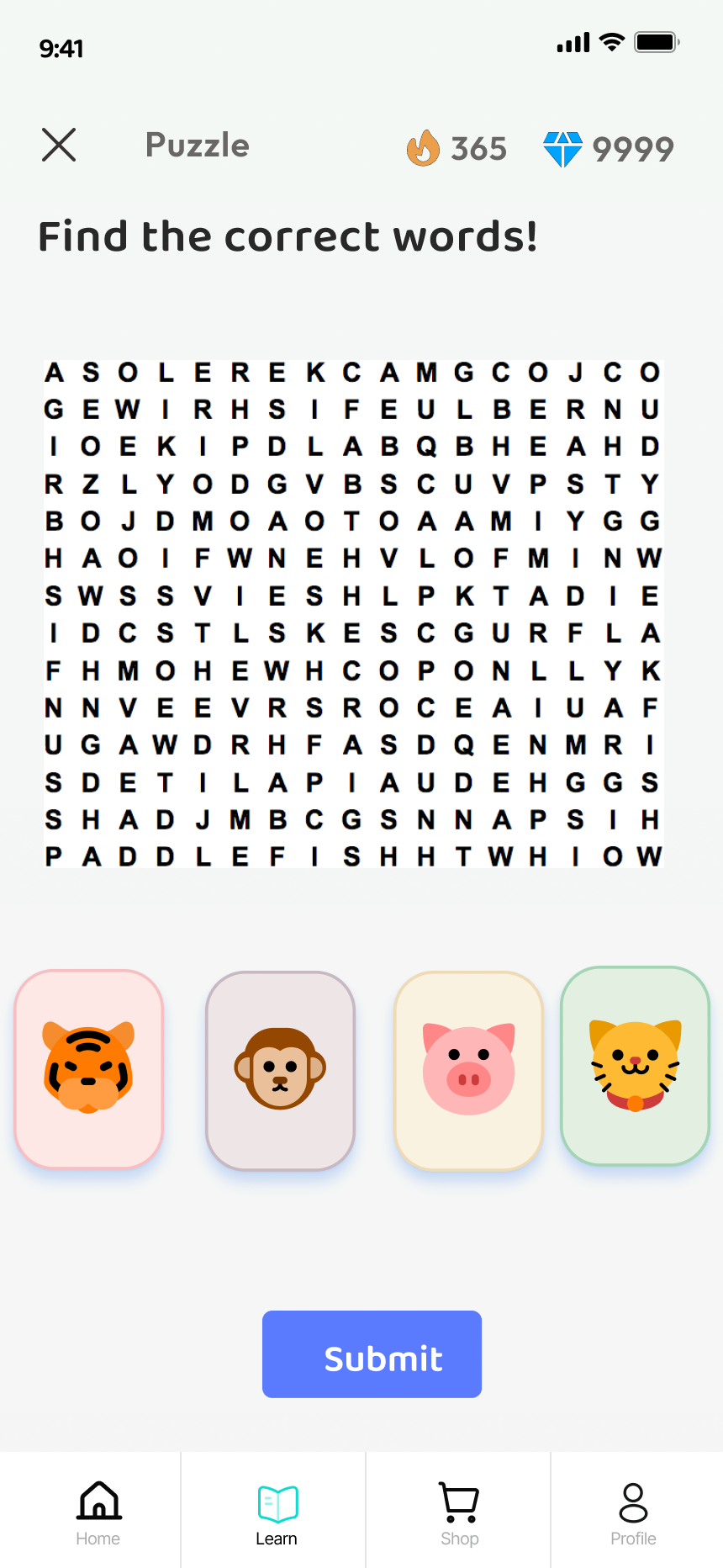
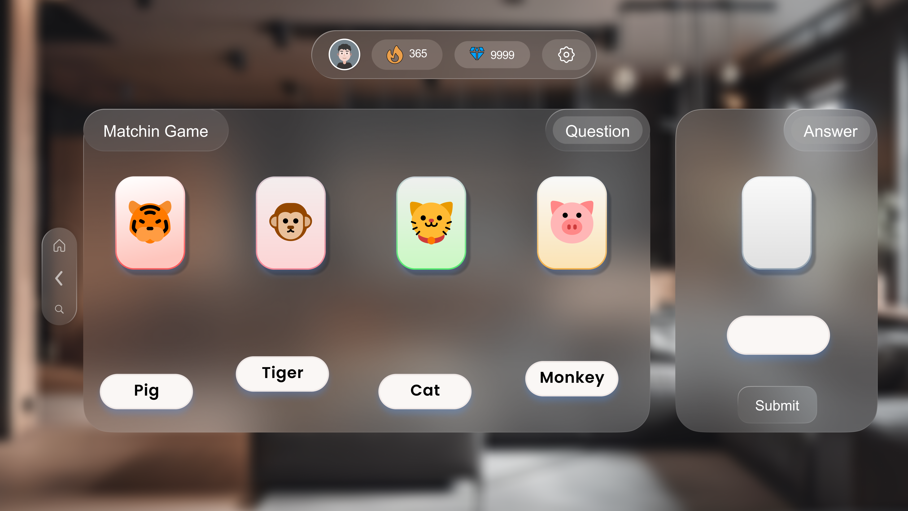
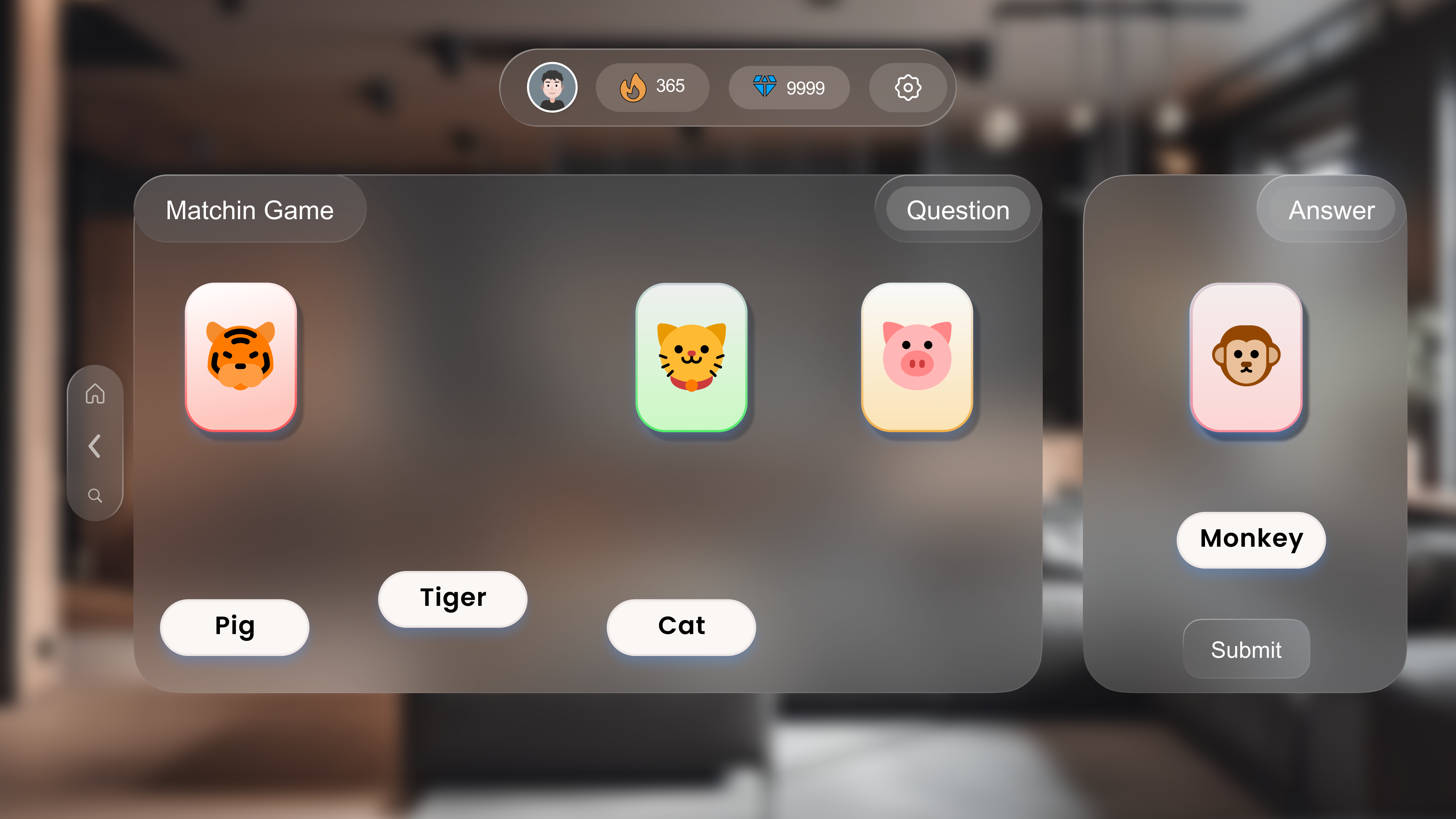
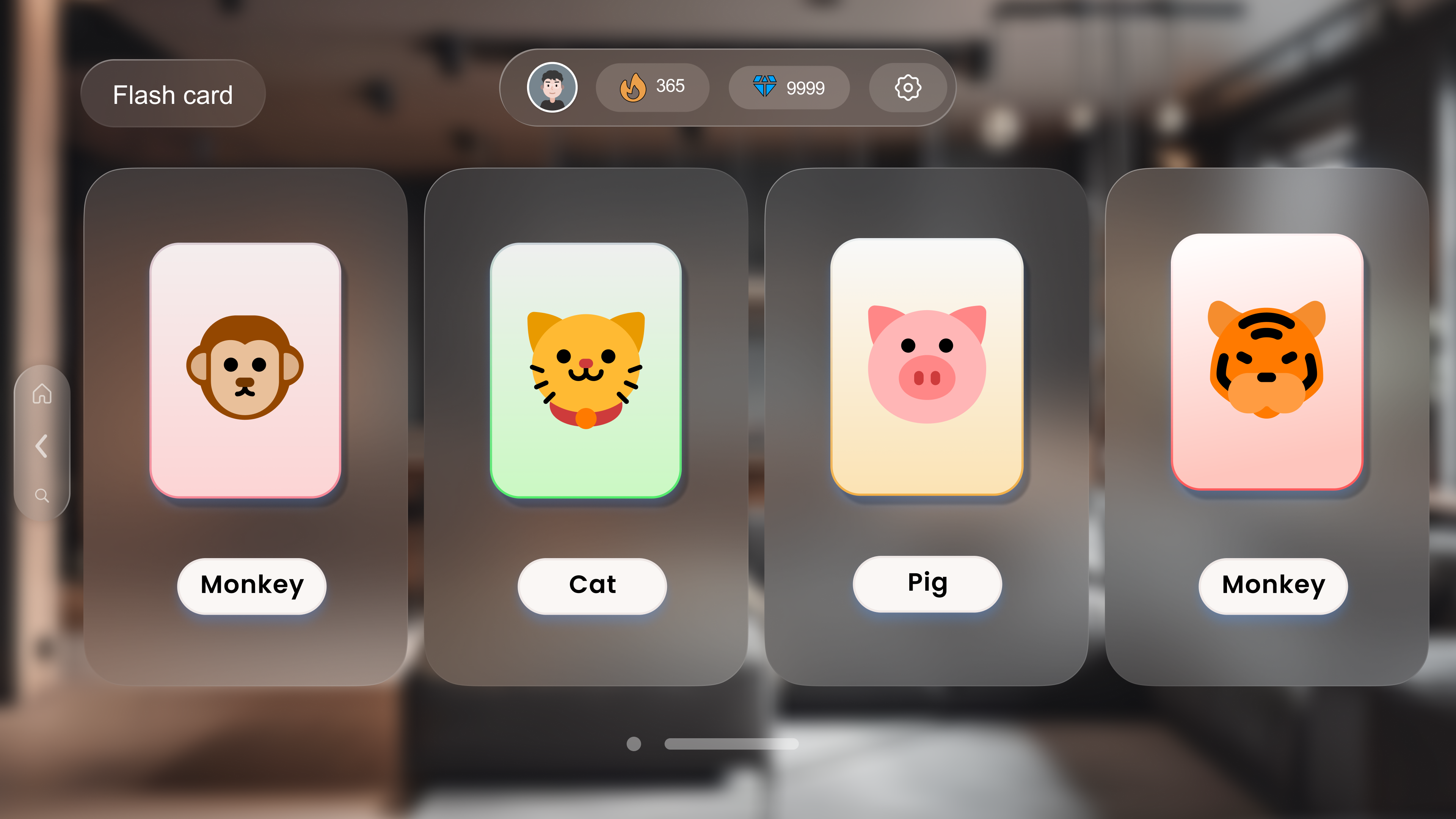
🌐 Web : Gameplay & Reward Loop
3 game formats — Matching (drag words to images), Flashcard (recognize
with label), Puzzle (word search). Pause menu gives children control:
Play / Exit / Help at any time (Nielsen: User Control and Freedom)
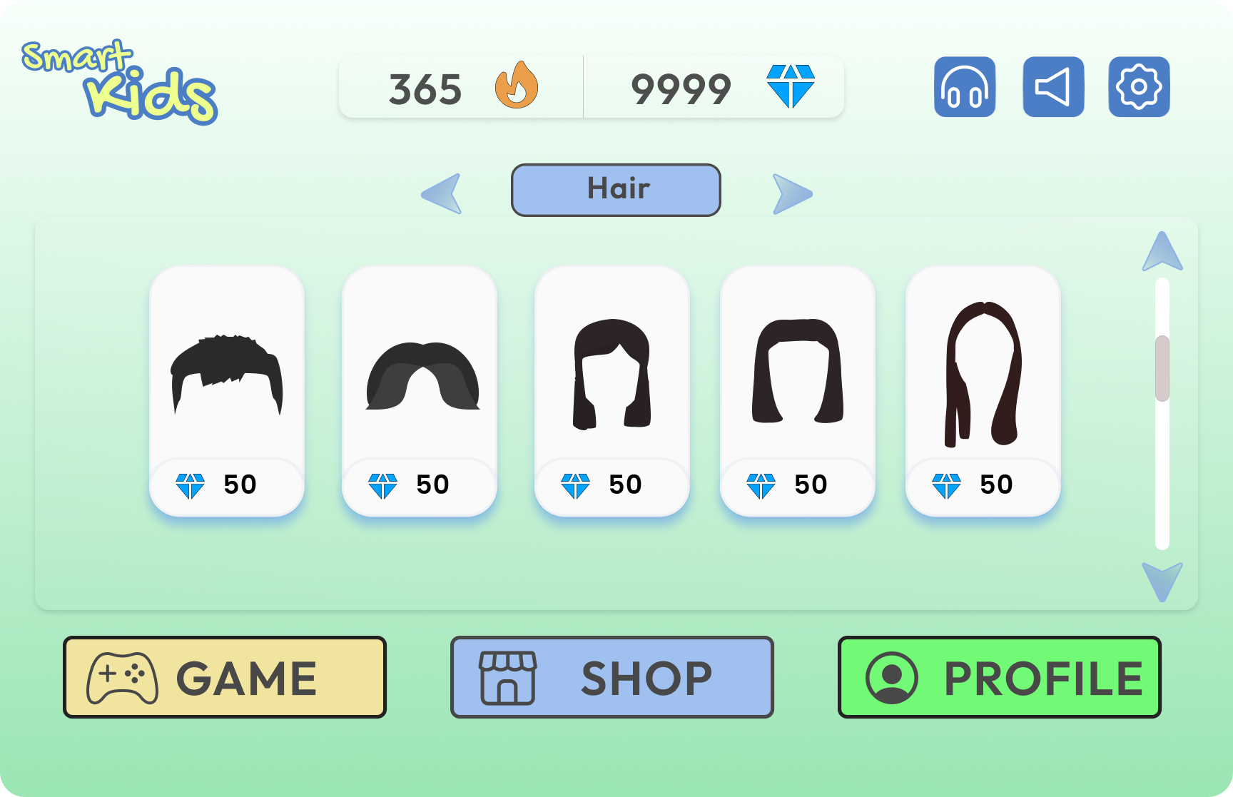
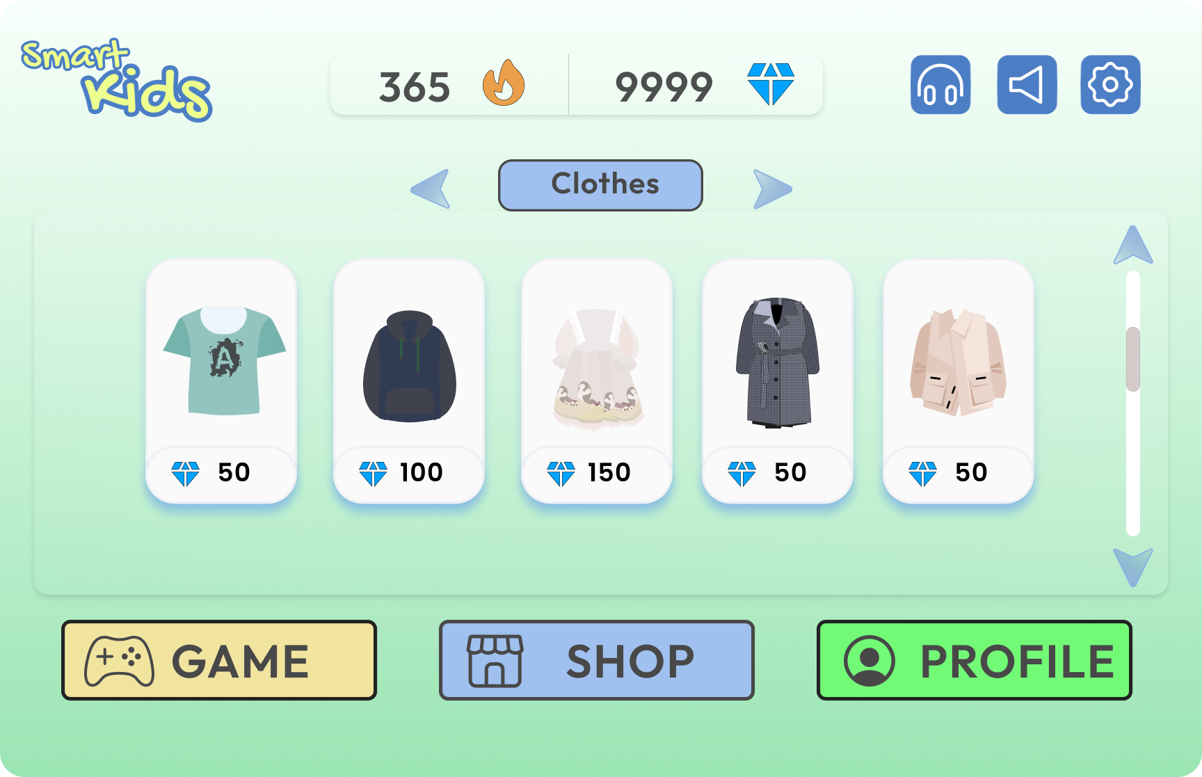
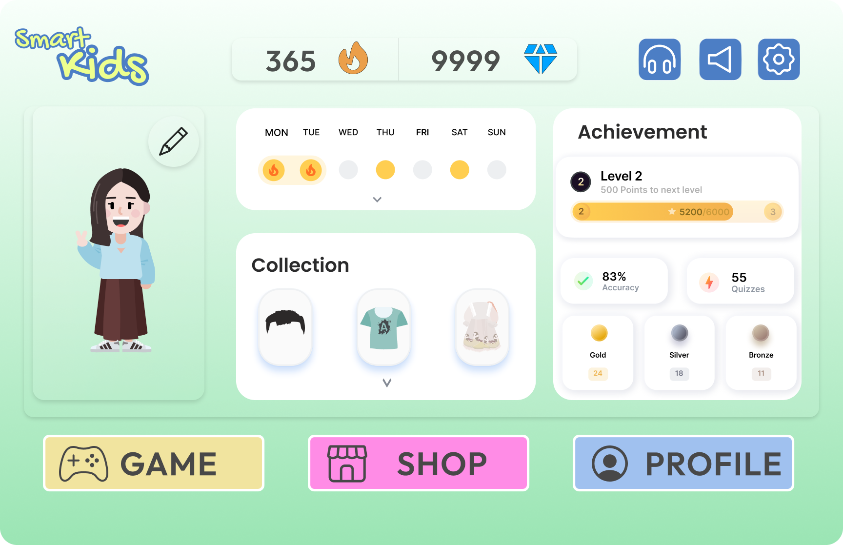
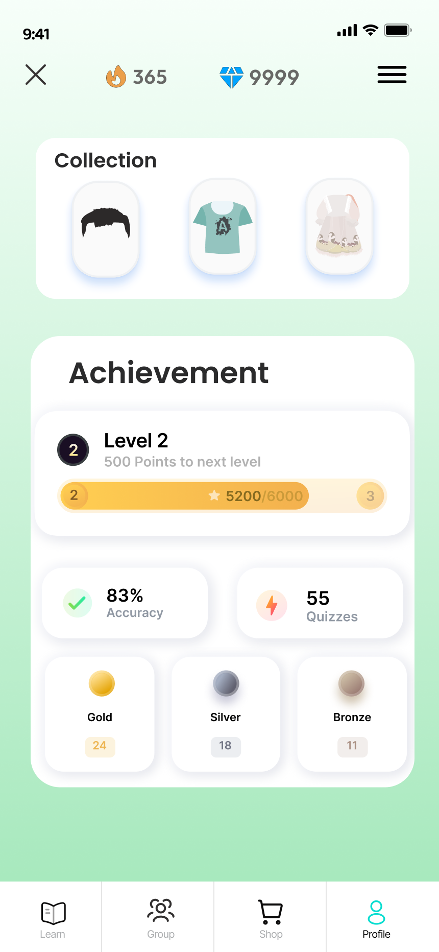
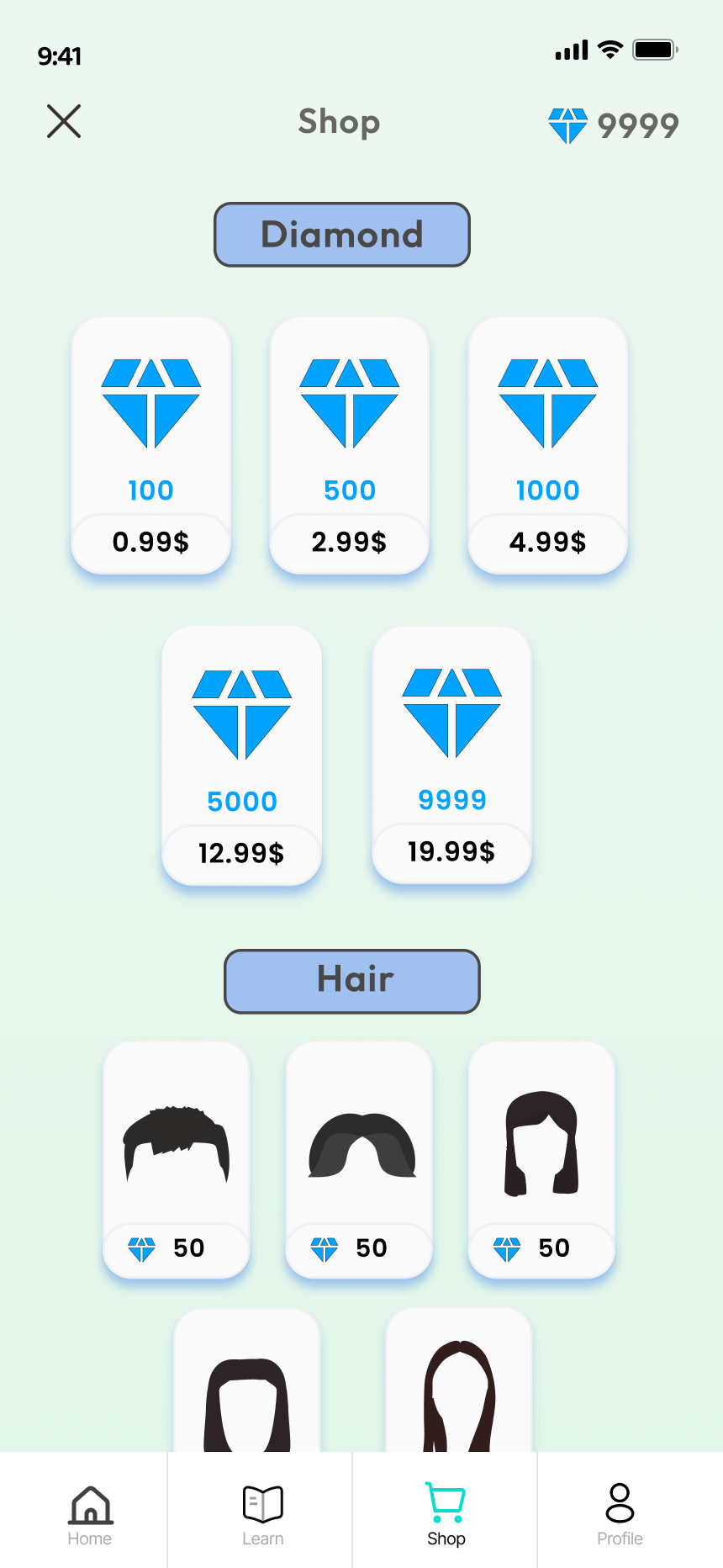
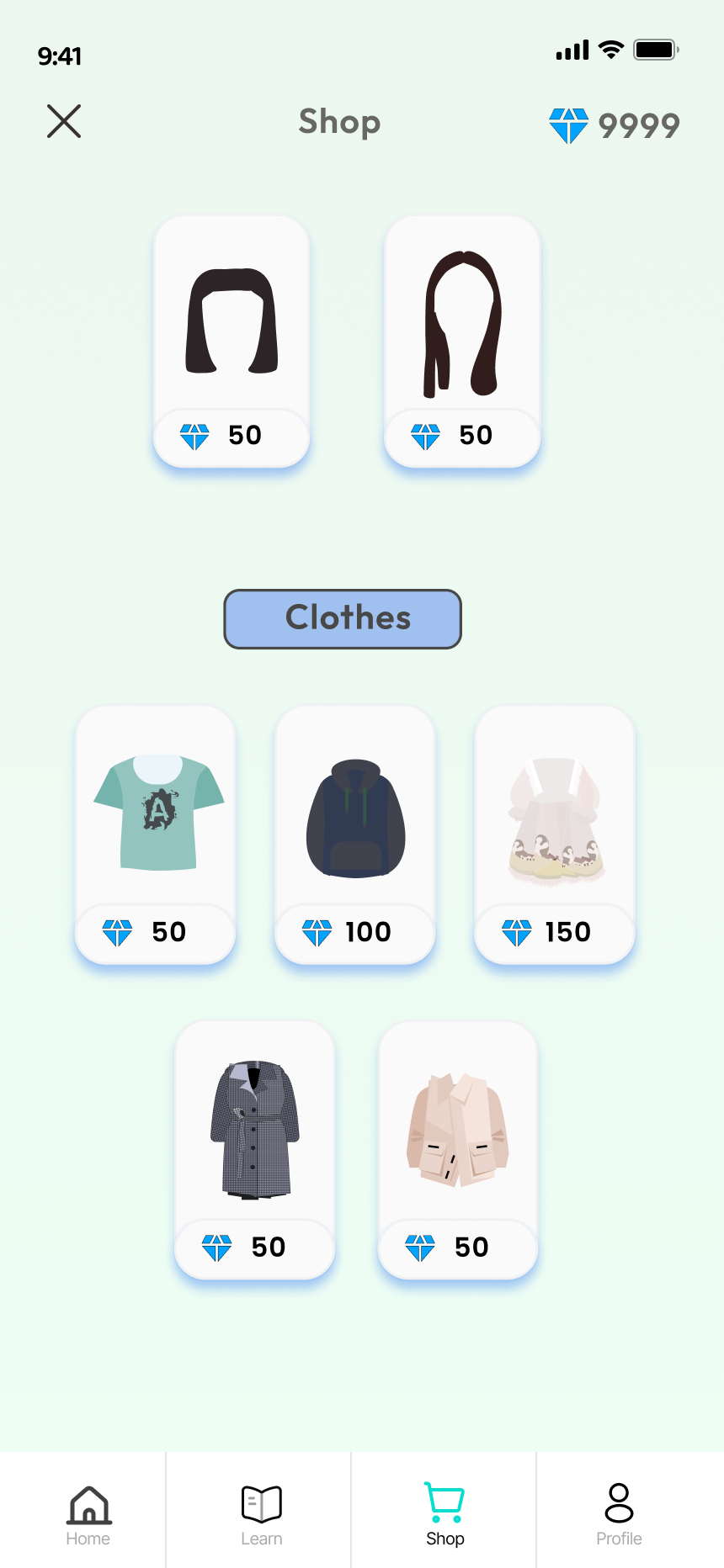
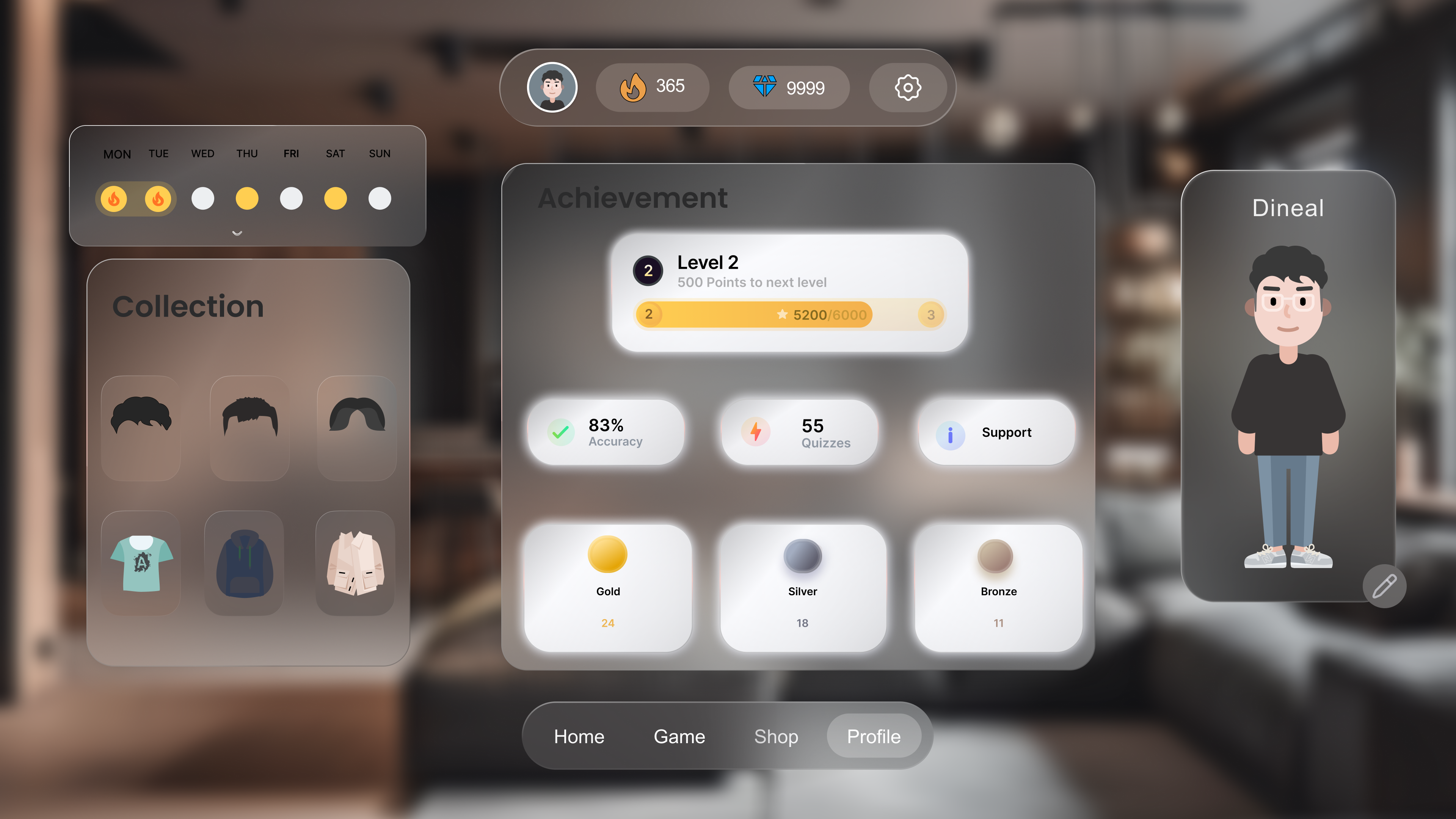
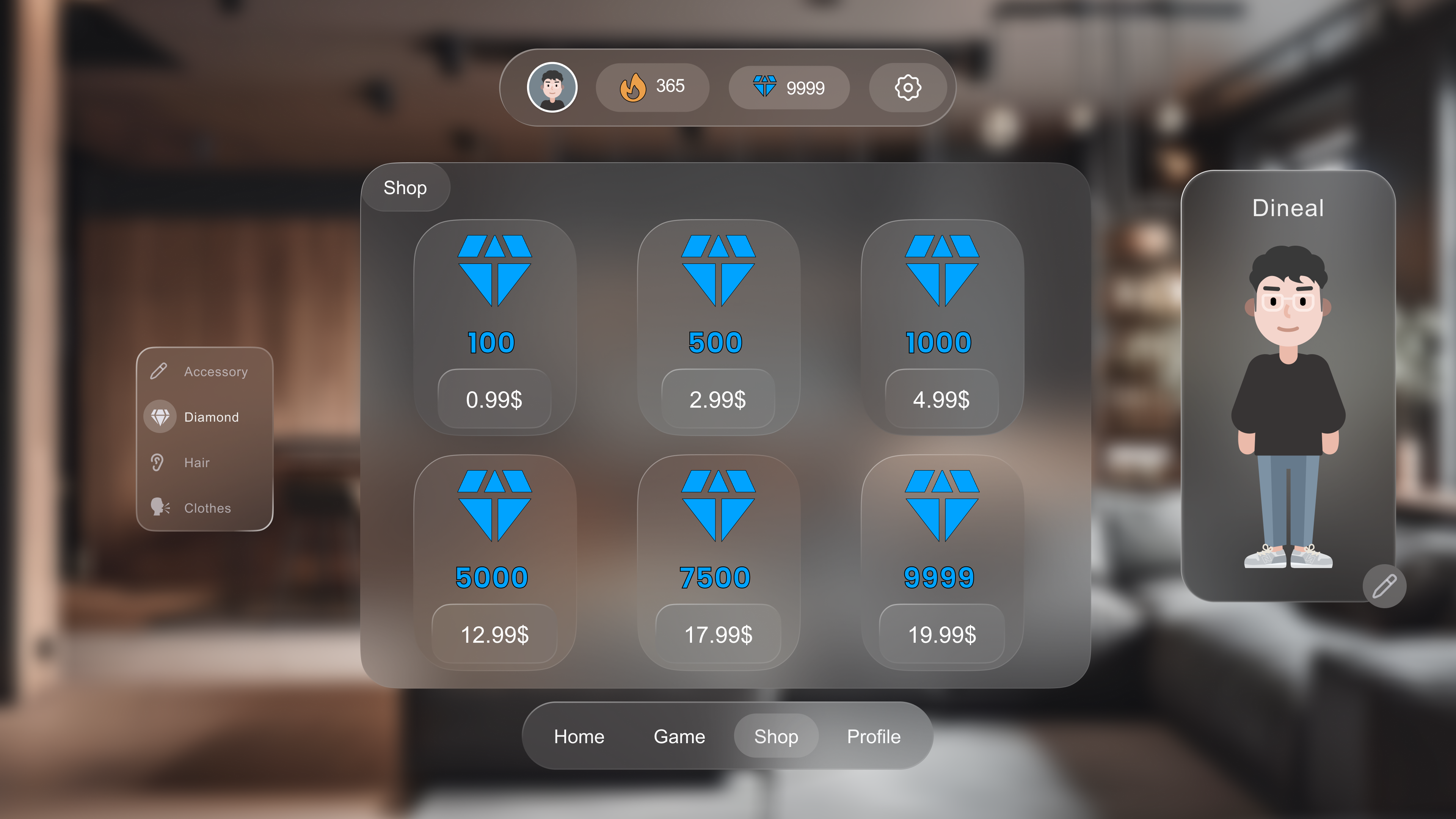
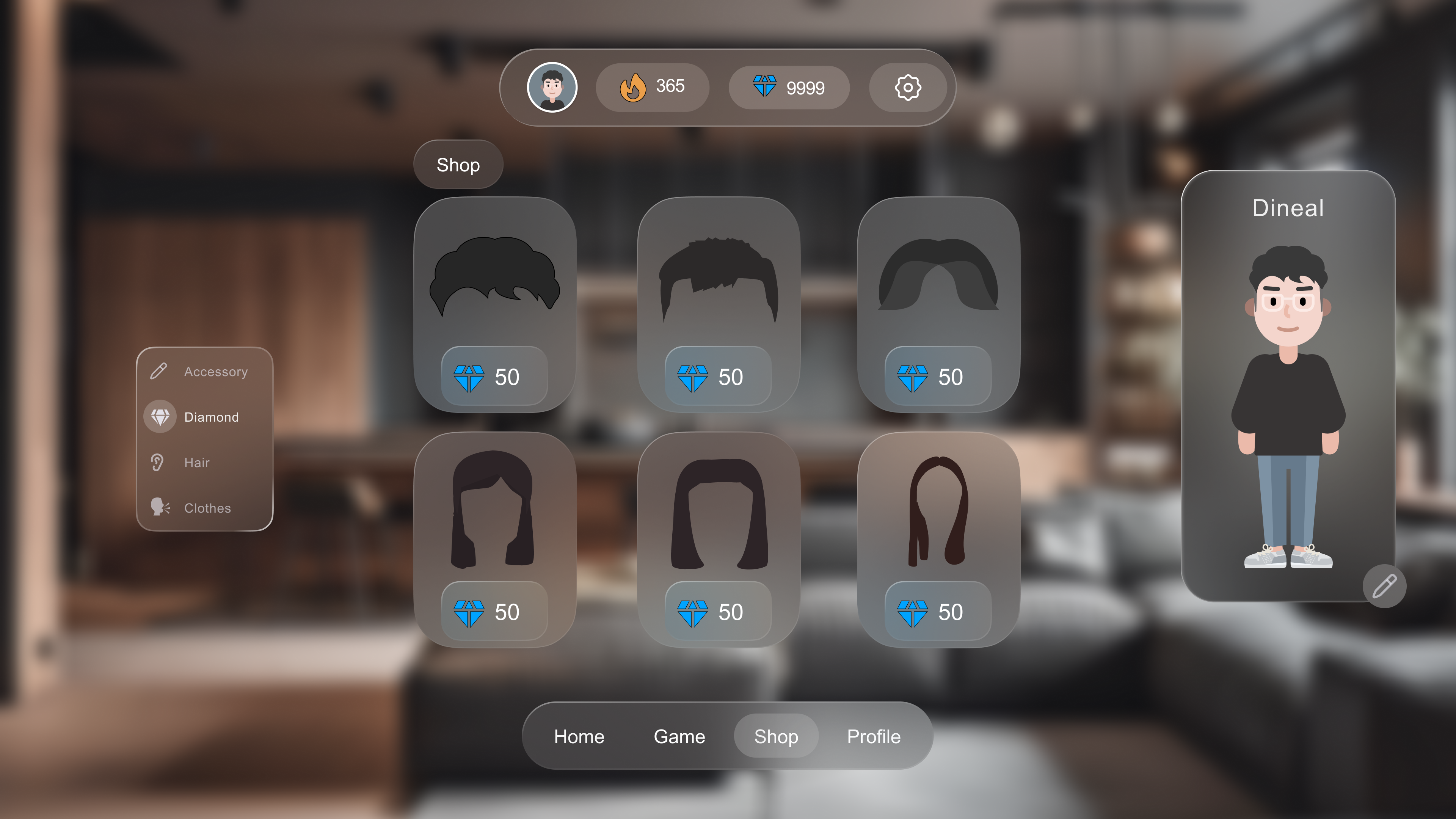
Complete reward loop: diamonds earned in games → spent in avatar shop
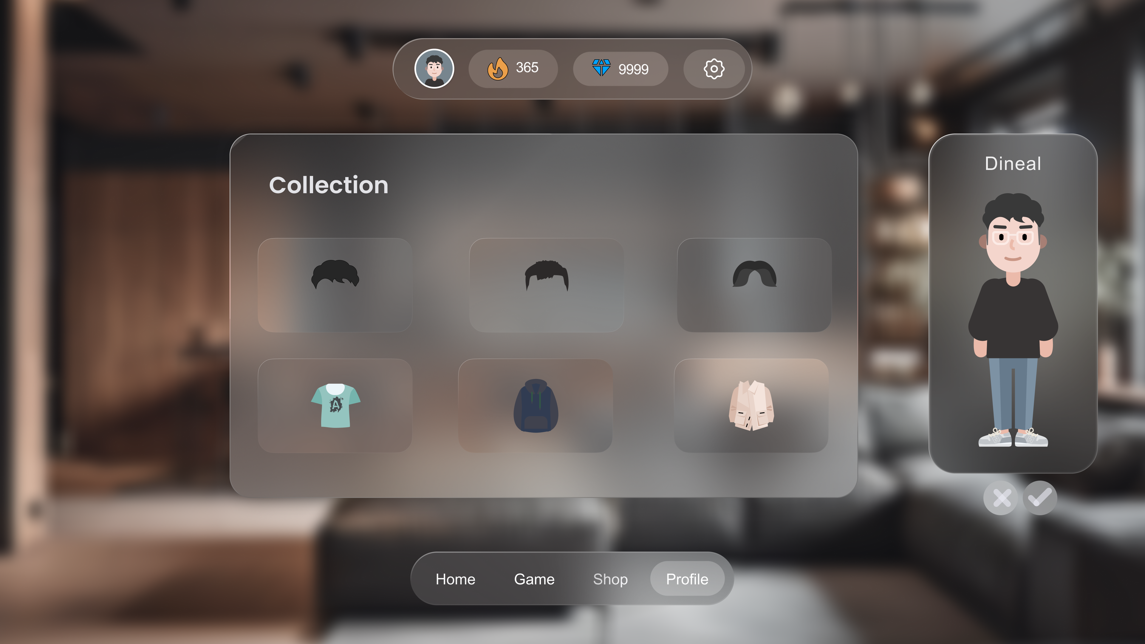
(hair, clothes) → progress visible in profile (streak calendar, 83%
accuracy, 55 quizzes, Gold/Silver/Bronze medals)
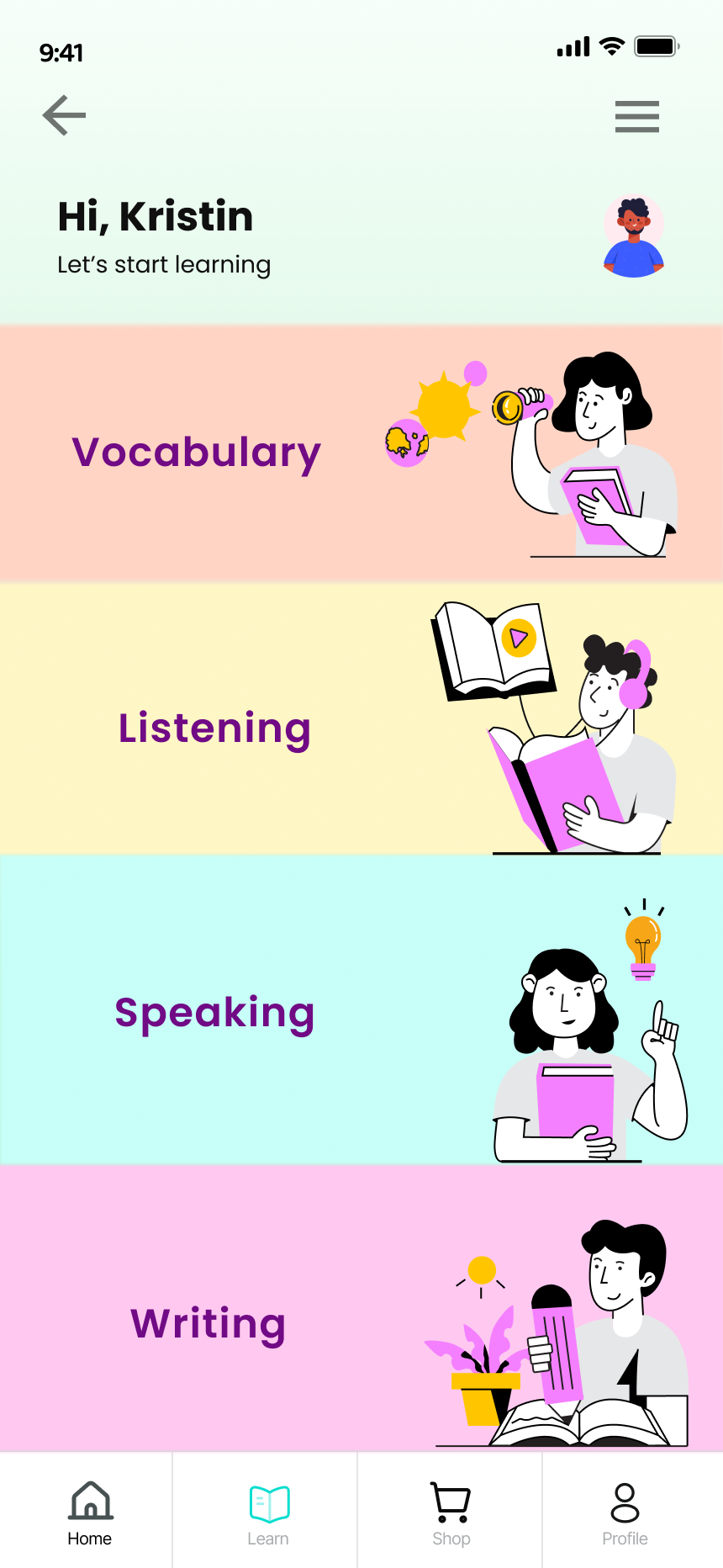
📱 Mobile : Adapted for Thumb Navigation
The mobile app adapts the web content into a thumb-friendly vertical
flow. A universal top navigation bar (back arrow + hamburger) appears on
every screen. Within games, it transforms into a context bar showing the
game name and the user's live streak and diamond count — always visible,
never intrusive.
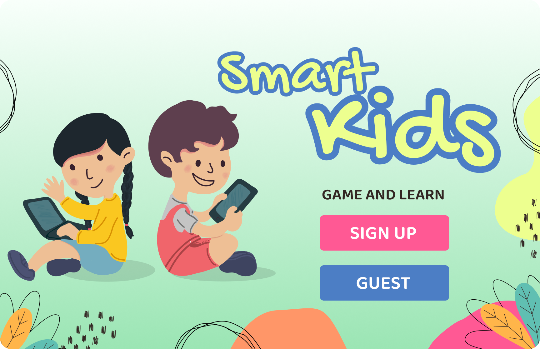
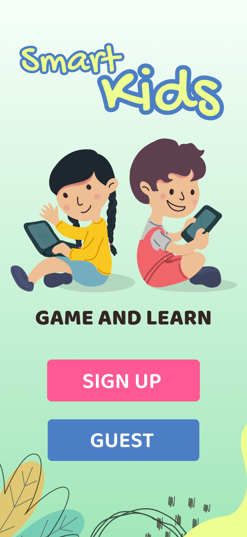
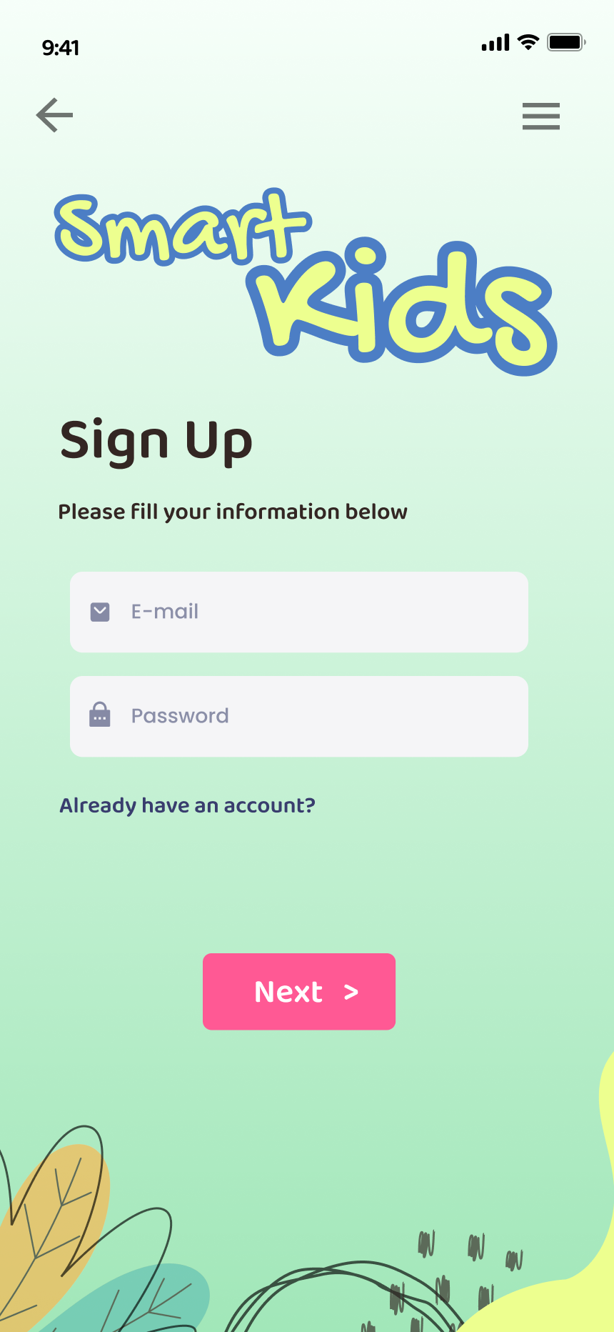
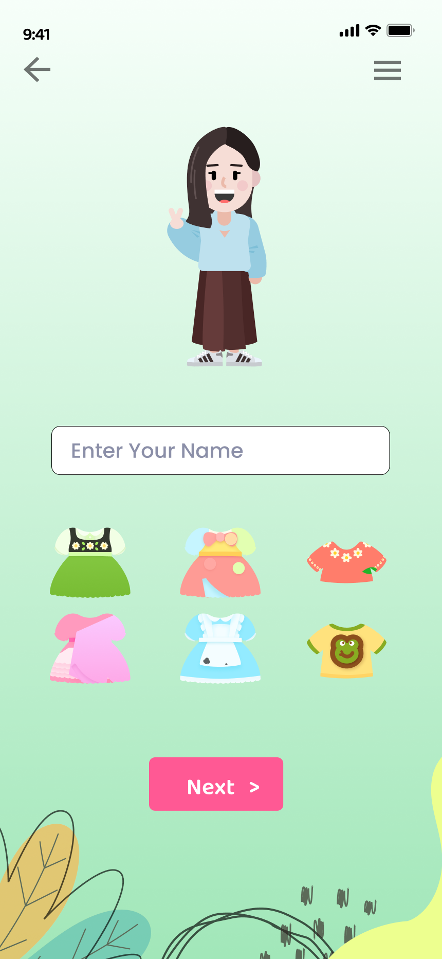
Mobile onboarding: Launch (SIGN UP / GUEST) → Sign Up → Email
verification → Avatar selection with swipeable carousel → Outfit
customization before first lesson
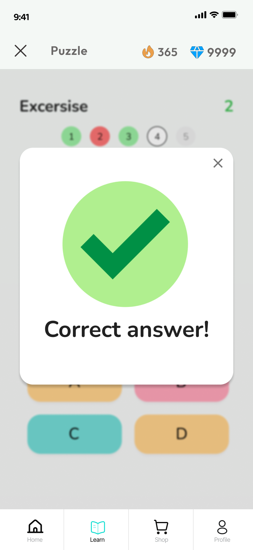
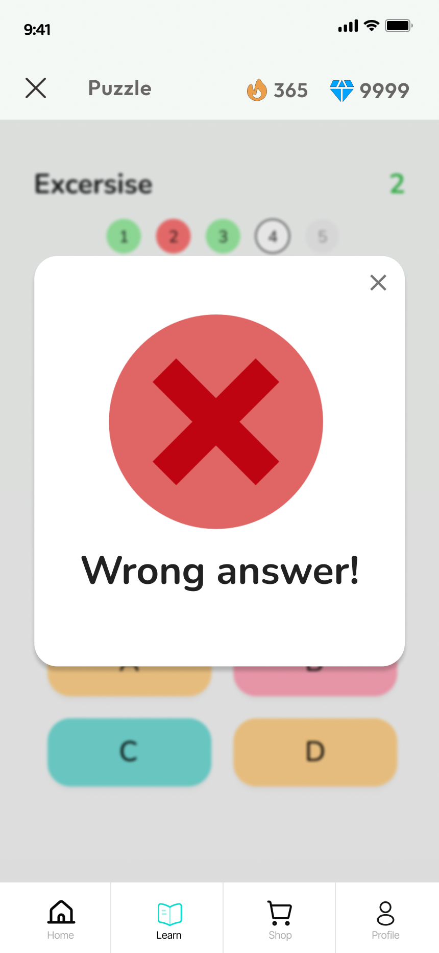
Game screens with persistent streak (🔥 365) and diamond (💎 9999)
counters. Answer feedback modals use large, unambiguous green ✓ / red ✗
— readable at a glance by young users (Nielsen: Consistency and
Standards)
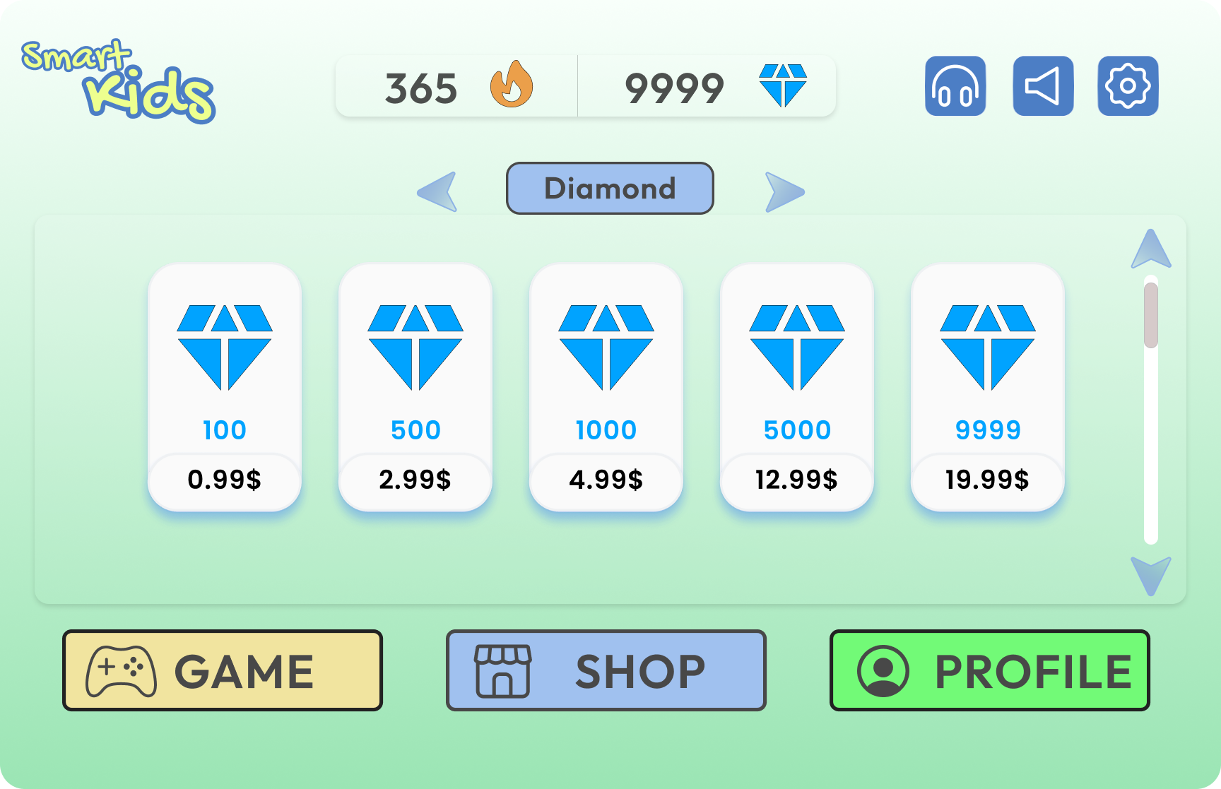
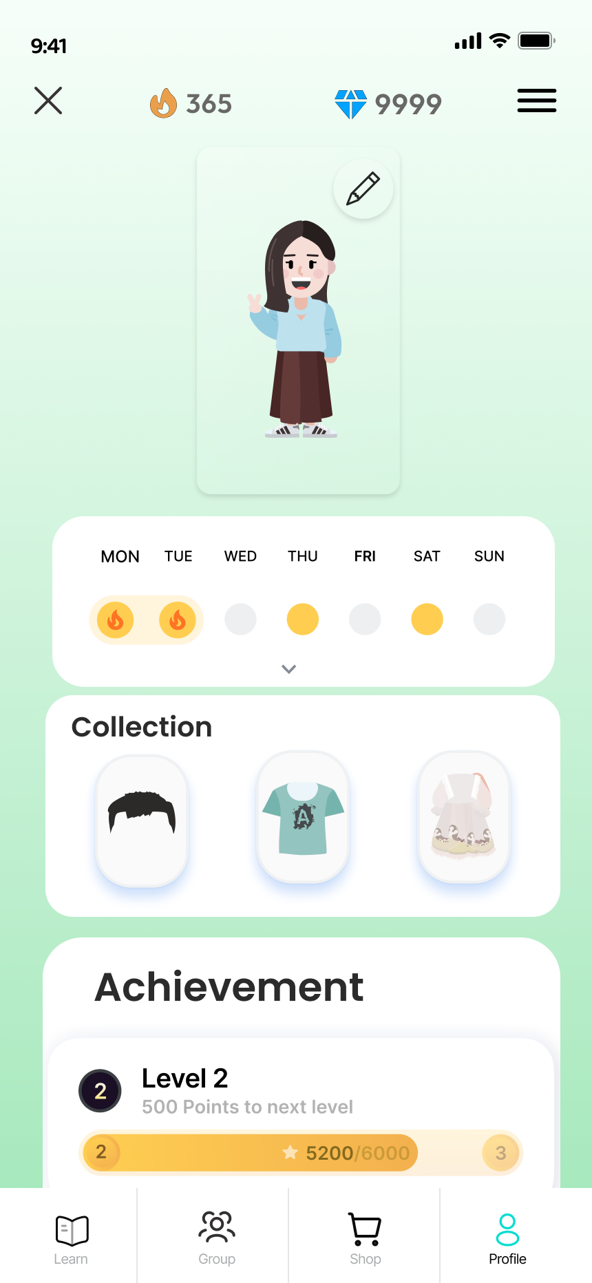
Profile: weekly streak calendar, collection, achievement level +
progress bar. Shop: diamond purchase tiers and avatar customization
items — closing the reward loop
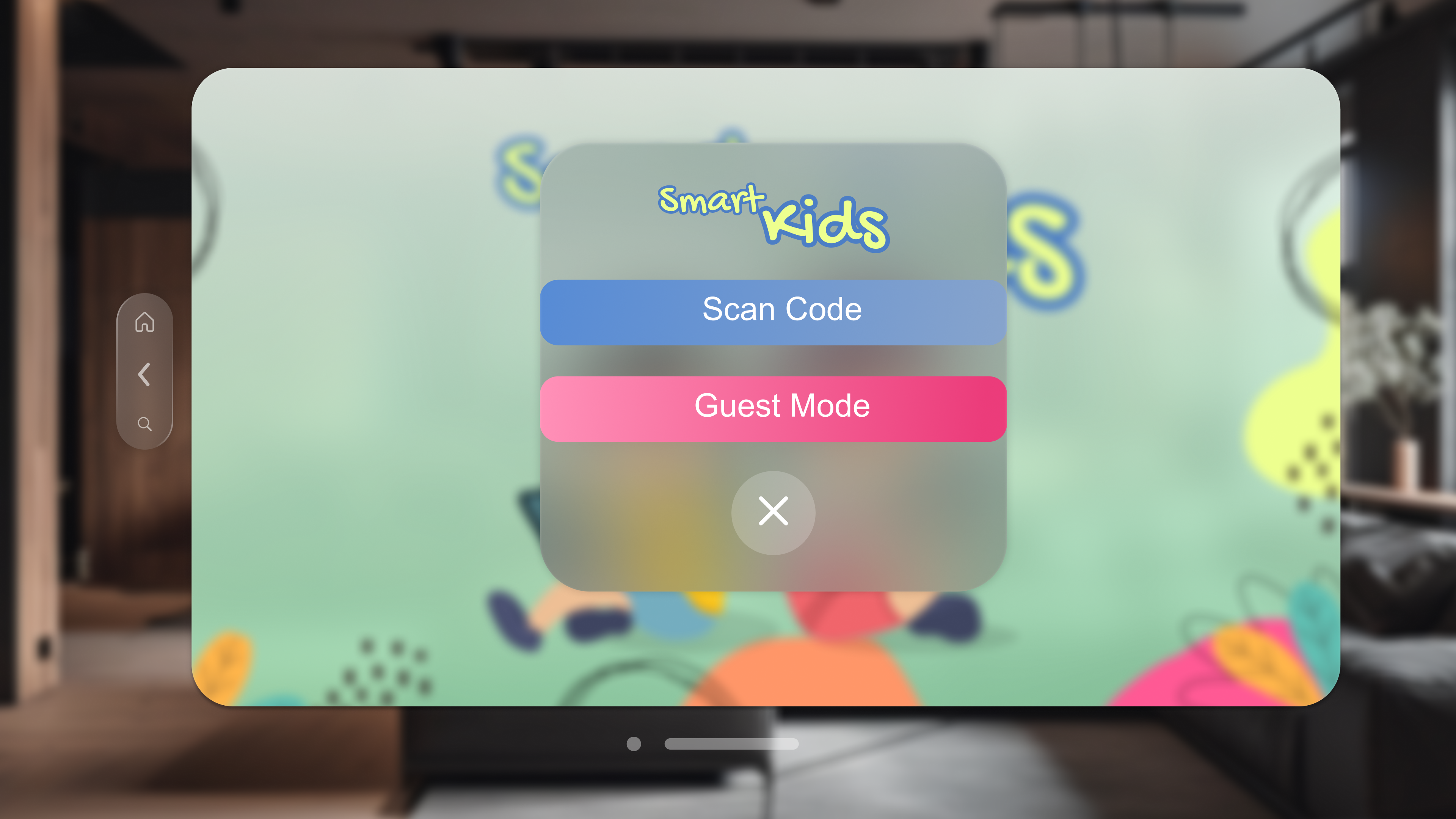
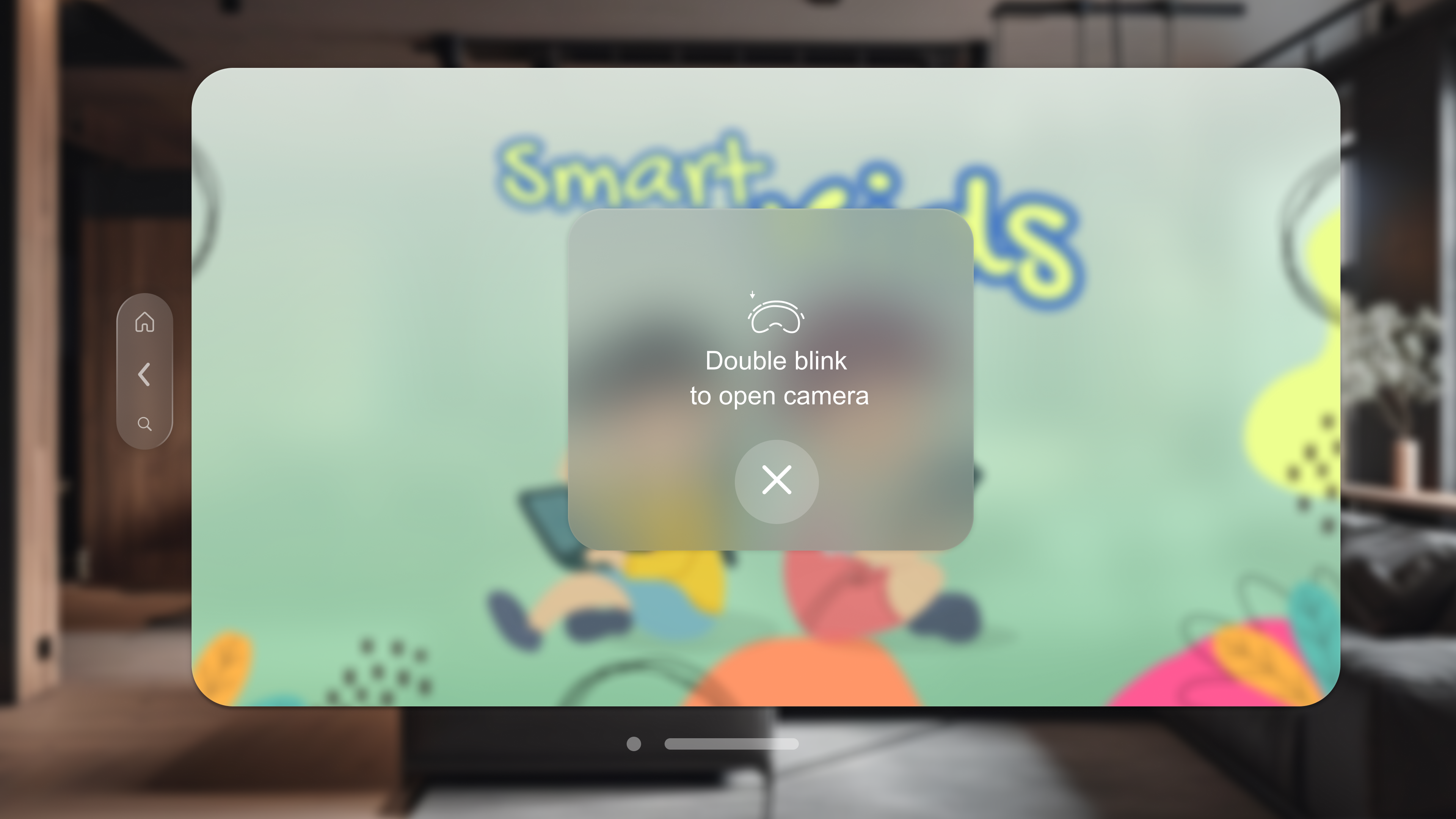
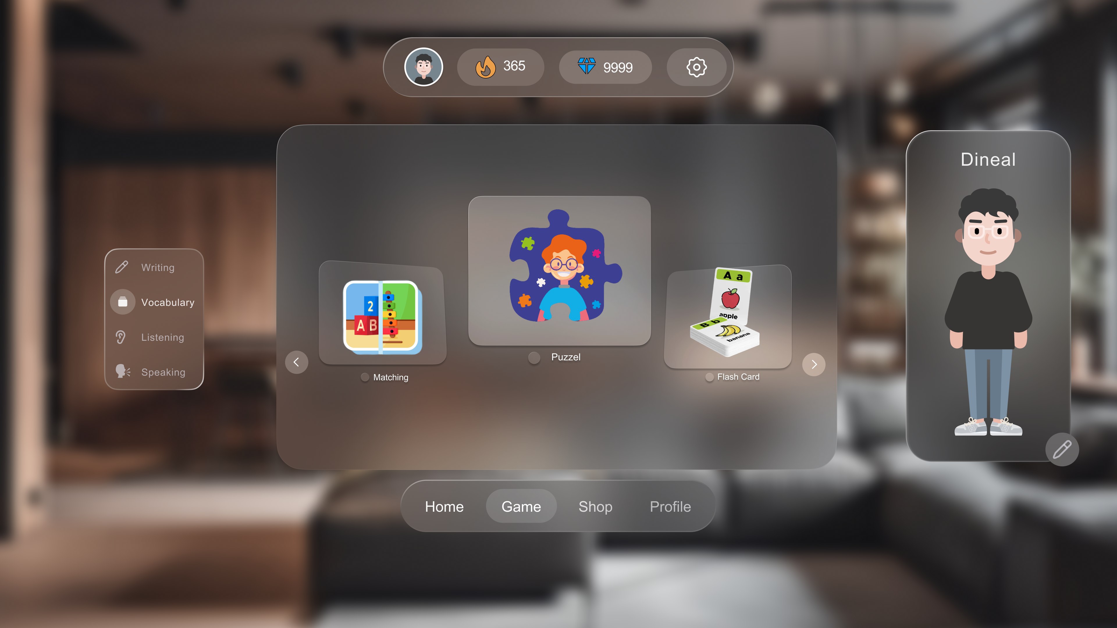
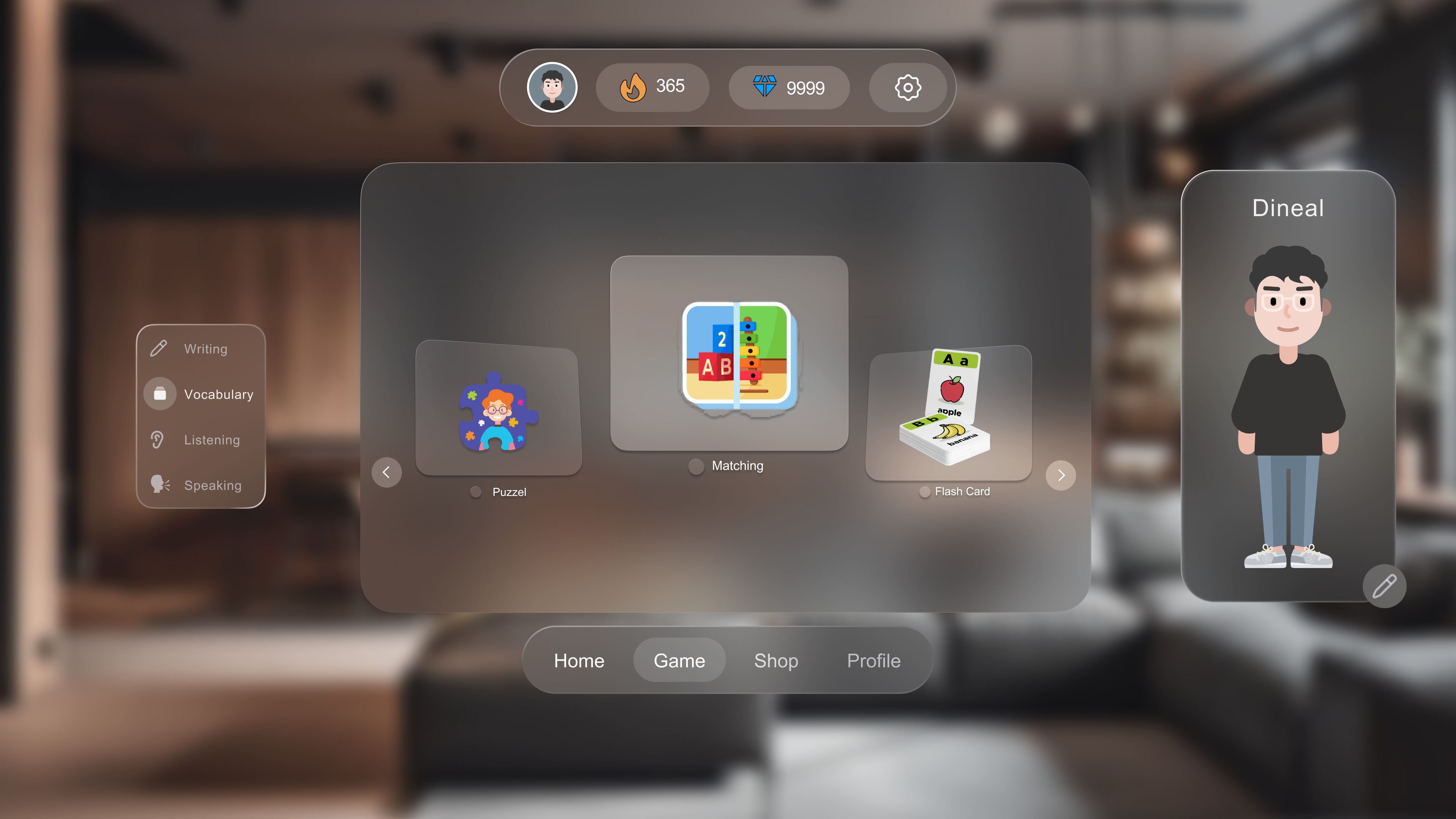
🥽 Apple Vision Pro : Rethinking Input from Scratch
The VR interface was the hardest platform to design — every input
assumption from mobile and web had to be reconsidered. Typing in VR is
one of the biggest friction points for new users, especially children.
The key decision: replace the standard keyboard login with a
QR scan + double-blink gesture.
The user scans their code from a phone or tablet. Login goes from ~30
keystrokes to 1 gesture. This is the design decision that best
illustrates the core principle of the project: treat each platform's
constraints as a design problem, not a porting exercise.
The VR home screen shows the avatar standing beside the user in their
real space, browsable with gaze and tap. Games open in a wide
three-panel layout — sidebar navigation on the left, game content in the
centre, avatar on the right. All 16+ screens maintain the same color
system and component patterns as web and mobile.
Profile: weekly streak calendar, collection, achievement level +
progress bar. Shop: diamond purchase tiers and avatar customization
items — closing the reward loop